Components variations in Storybook
Component variations, or Stories as they are called in Storybook, help you write less and more flexible code to adapt to multiple content display scenarios.

One great way to extend your catalog of components is by creating components variations. Variations, in the context of component-driven development, refers to displaying your content in different ways. Variations of a component reduce the need of building new components as well as duplicate code.
In Storybook, variations are known as Stories. In this post I will be using variations and stories interchangeably.
NOTE: Although this tutorial might work in a non-Drupal environment, this post is a follow up to previous tutorials that are Drupal-specific. The syntax and plugins used in this tutorial are for a Drupal and Twig environment.
The image below shows how different card stories or variations, can display the same content in many ways.

Fig. 1: Example of multiple variations of a Card component.
Principles of building components
Sometimes when building a new component, we can't anticipage how the website will evolve with time and therefore we build components the best way possible at the time of building them. As time goes by and requirements change, we realize that we could have done things differently had we known about the requirements changes. Variations of a component give you a chance to alter how something was built without having to change your entire environment of content architecture.
Some time ago I wrote about principles for building components. Rather than repeating myself, take a quick look at the article and comeback when you are done. You will find those principles not only apply to building new components, but also to building variations of components.
Building component variations in Storybook
In Storybook, all variations of a component are referred to as "Stories", hence the name Storybook. A story captures the rendered state of a UI component. Developers write multiple stories per component that describe all the “interesting” states/variations a component can support. Here's a visual that describes the official naming and hierarchy Storybook uses.

Fig. 2: Storybook's official naming convention and hierarchy.
The Card component
First off, I am going with the assumption that you already know how Storybook stories are created and that you have a Storybook instance running. If that's not the case, follow these instructions to get your Storybook environment up and running. You will need NodeJS 20+ and NVM installed on your system to follow along.
Next, let's look at the Card variations we will be creating in this post.
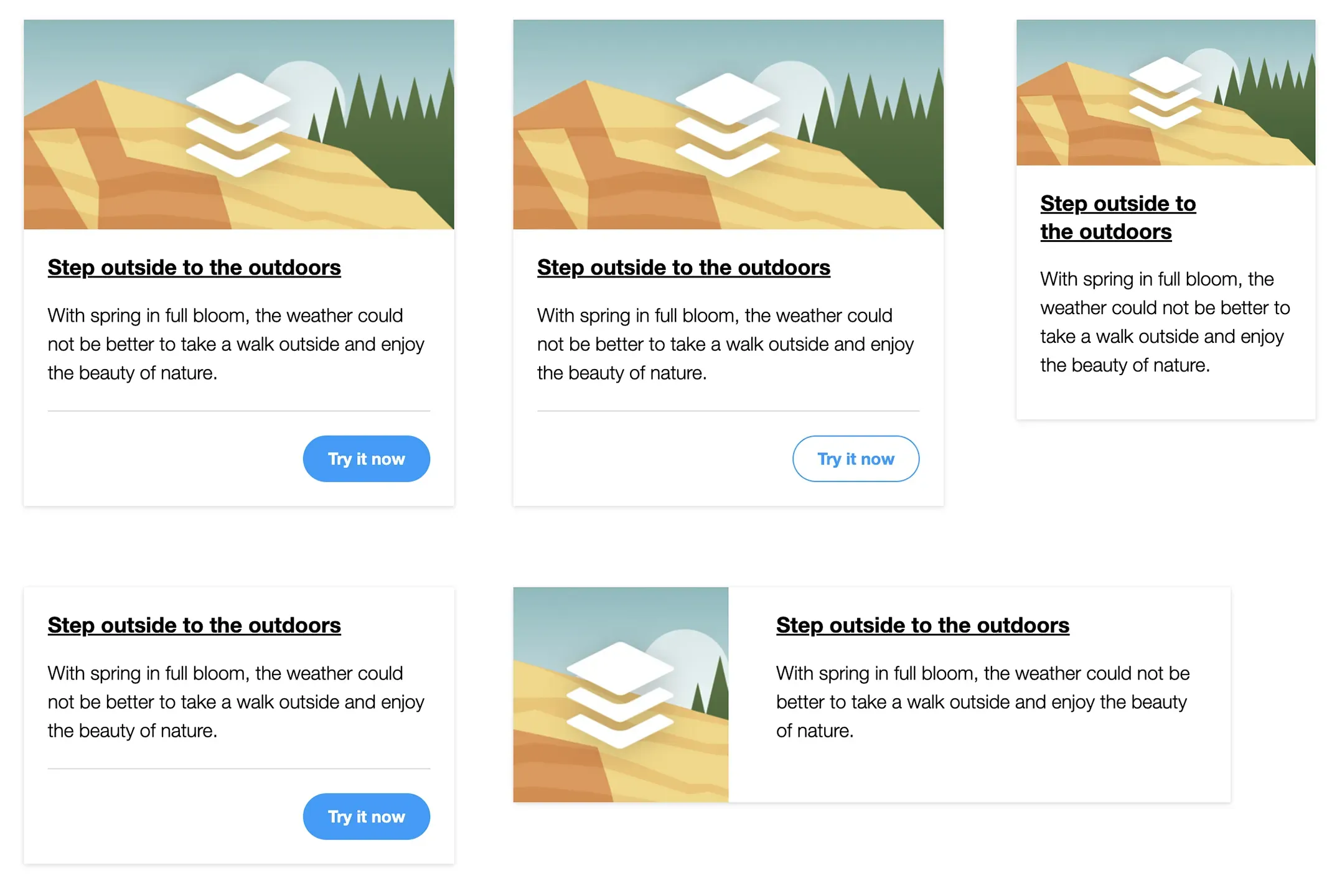
Fig. 3: Example of the different card variations we will build in this post.
The image above shows the Card stories or variations we will build. From top-left to right:
- Default or Stacked
- Light CTA
- Small
- No image
- Horizontal
In the interest of time, I have a repo that already includes the base of the Card component so you can focus only on building the variations.
Clone the repo which already contains a project to work with and the Card component.
If you already have a working Storybook environment, copy the components directory (
src/components), from the newly cloned repo, into your project.Switch to the variations branch by running
git checkout variationsRun the project as instructed in the README in the repo
Methods for creating stories
In this tutorial, we will use two methods for creating variations in Storybook:
- Doing all the work directly in
card.stories.jsxto change fields values or hide/show fields, depending on the story requirements. - Using additional
*.ymlfiles to assist with the same fields updates above.
We will be using the first method above for all stories except the Card horizontal. The original Card component was built with Twig, but for the variations we will be working exclusively in card.stories.jsx. The current version of the card story looks like this:
import parse from 'html-react-parser';

import card from './card.twig';
import data from './card.yml';
import './card.css';

const component = {
  title: 'Molecules/Card',
  render: (args) => parse(card(args)),
};

export const Card = {
  name: 'Card stacked',
  args: { ...data },
};

export default component;
Let me explain the snippet above as this is the foundation for all the variations we will be creating.
First we do a series of imports to collect all the pieces needed to build components and stories:
- import parse: This is a react plugin which allows us to parse the HTML in our stories into React code Storybook can understand.
- import card: It imports all the code and logic inside our component's twig template.
- import data: Pulls in all the data from the component's .yml file so we can use it as React args.
- import './card.css': Imports all CSS styles so Storybook can displayed the styled components and stories. Inside card.css, we already have styles for each of the stories we will be building.
Next, we set a new configuration object called component, which will serve as the default instance of the card component. This is an arbitrary name and can be anything that makes sense to you.
Inside the component object we have two properties: title and render.- The title property's value determines the location and name of the component within Storybook's hierarchy. In this example the Card component will be located under the Molecules folder. See Fig.2 above for details about the hierarchy.
- The render property is what handles the rendering of the component by using the card and data objects we imported earlier, and combined together (Twig and YML), they render the full component.
Next, we create our first story by defining a new configuration object called Card, in which we pass a name (Card stacked), for the story and the data variable as args.
Finally, we export the component object as default, which is a React requirement.
If Storybook is running, you should see the new variation which will display the Card stacked. If you need to run Storybook for the first time, in your command line navigate to the storybook directory and run these commands:
IMPORTANT: You need NodeJS 20+ and NVM installed in your system.nvm install
npm install
npm run build
npm run storybookIf all goes well, Storybook should be running showing the Card stacked story under the Molecules folder.
Preview of Card stacked
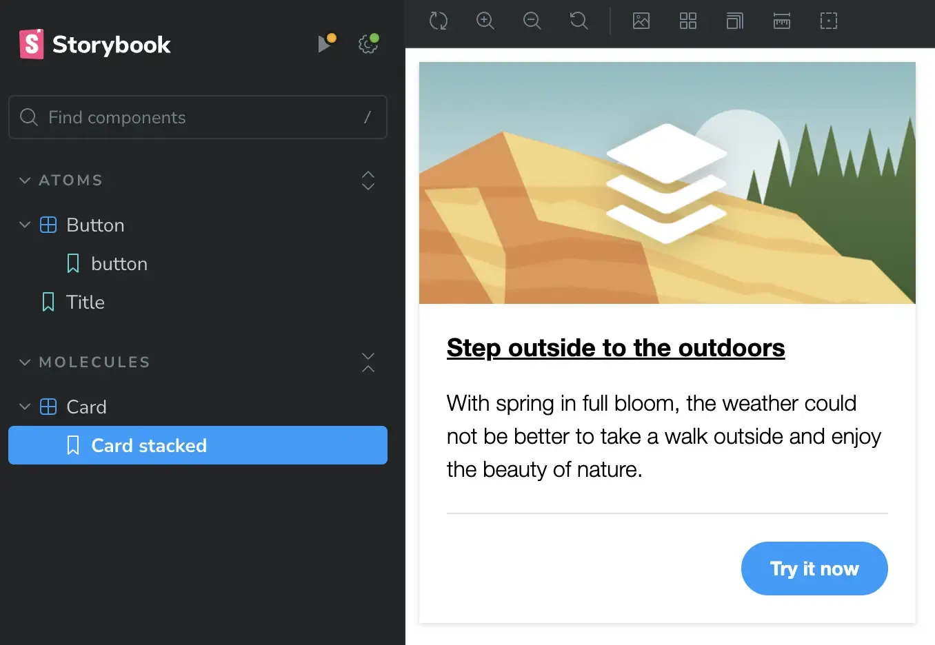
Fig. 4: Example of the Card stacked from which other variations will originate.
Card with light CTA
- Inside
card.stories.jsx, and directly after the closing of the Card object (around line 17), add the following object to create a new story:
export const CardLightCta = {
  ...Card,
  name: 'Card light CTA',
  args: {
    ...data,
    cta: {
      modifier: 'button--light',
      text: 'Try it now',
      url: 'https://mariohernandez.io',
    }
  },
};
Let's go over the snippet above:
- We start by creating and exporting a new object called CardLightCta. This is a new story. This name is arbitrary but it should be unique for each story.
- Next, we pass the default Card story (
...Card), as a spread operator, so the new story inherits all attributes from the original card. - The name property allows for each story to have a unique name which will appear directly under the component name in Storybook's sidebar (see Fig. 2 at the top for details).
- Finally, we open the args object where we will update some of the fields to achieve the desired variation:
- We pass the
...dataobject as a spread operator to individually update the fields that need updating. - Since the only difference between this variation and the original card is that the CTA is light, we need to define the
ctaobject and provide each of its properties with the appropriate values:- First as a modifier class we pass
button--light. This is a predefined modifier class which will turn the CTA white. - Next, we type the text that will become the CTA's label, Try it now.
- And finally, we pass a URL to the CTA.
- First as a modifier class we pass
- We pass the
Preview of Card with light CTA
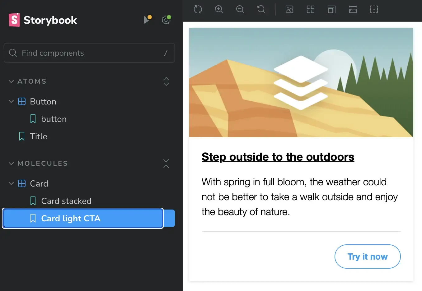
Fig. 5: Example of a Card component with a light CTA.
Card small
This next story or variation is the small version of the card. The difference between this card and the original one is that this one has no CTA, and its size is ...well, small 🙂
Same as before, add the following snippet to card.stories.jsx directly after the closing of the card with light CTA story:
export const CardSmall = {
  ...Card,
  name: 'Card small',
  args: {
    ...data,
    modifier: 'card--small',
    cta: '',
  },
};
This story is very similar to the previous one from the updates needed point of view. As you can see, the only thing we are doing is passing card--small as a modifier class to the entire component, and since we don't need a button or CTA, we are defining the cta object but its value is empty which will suppress it from printing on the page. If you notice in card.twig, we use a conditional that checks if the cta object exists, otherwise don't print any of the markup starting with the footer tag.
Preview of small card

Fig. 6: Example of a small card.
Card with no image
- You know the drill, inside
card.stories.jsx, directly after the closing of the previous story, add the following snippet:
export const CardNoImage = {
  ...Card,
  name: 'Card no image',
  args: {
    ...data,
    modifier: 'card--no-image',
    image: '',
  },
};
Even more similar to the previous story, this variation only varies from the original story as follows:
- We are passing a modifier class to the component,
card--no-image. - Since we want no image, we define the
imageobject but leave its value empty.
Preview of card without image
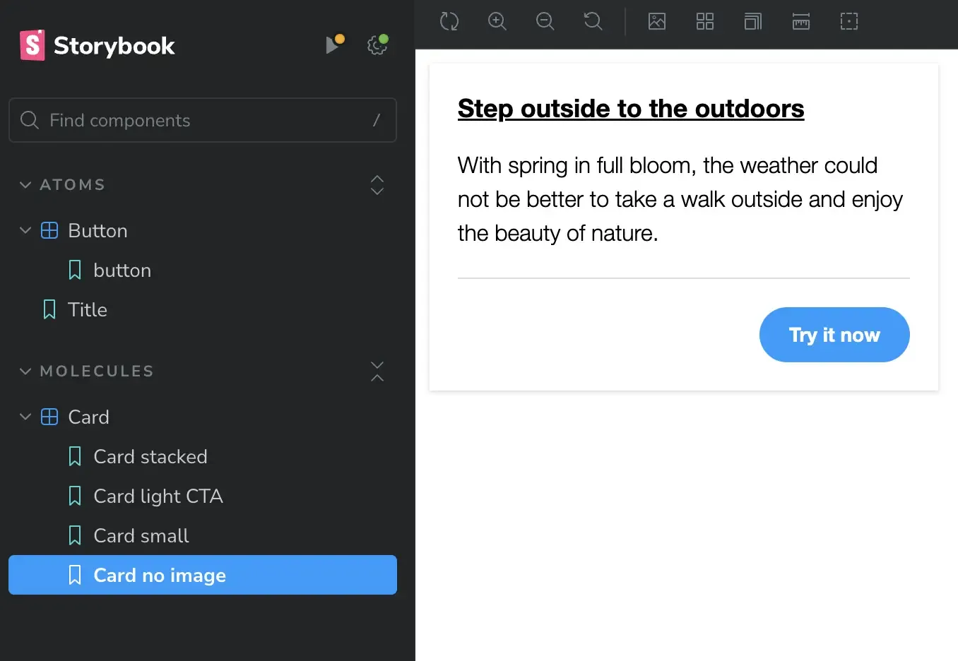
Fig. 6: Example of a card without image.
Card horizontal
The final variation is the Card horizontal. For all previous variations we have done all the changes inside card.stories.jsx, but for this one, we will resource to using an alternative *.yml file. Why you may ask, well, this variation requires a bit more changes and making all those changes inside the stories.jsx file may look a little too busy and not as easy to read the code. That's pretty much the only reason for me to use this method, to keep the code in my stories clean and more readable.
You may have noticed in the project you cloned; inside the card directory we have a file called card-horizontal.yml. This file is almost identical to the original card.yml as far as the fields in it. The only difference is that some of the fields have unique content or no content at all. Let's look at the file before starting.
---
modifier: 'card--horizontal'
image: <img src="/card-square.jpg" alt="Palm trees near city buildings" />
title:
  level: 2
  modifier: 'card__title'
  text: 'Step outside to the outdoors'
  url: 'https://mariohernandez.io'
teaser: 'With spring in full bloom, the weather could not be better to take a walk outside and enjoy the beauty of nature.'
cta: ''- The modifier field has a specific CSS class we will pass:
card--horizontal. This class will allow us to change the layout of the card to be in horizontal direction. - The image field uses a different image altogether. The image has been cropped in square aspect ratio for better fitting of this variation.
- Finally, the cta field is empty, meaning we don't want to print a button on this variation.
Maybe I exaggerated when I said that this variation has too many changes, but my point is that in cases when your stories do require a lot of changes, using a different yml file may help you keep your stories.jsx file a lot neater and cleaner.
- The first step is one we haven't done before. Inside
card.stories.jsxsomewhere around line 5 (after the last import in the file), add the following import:
import dataHorizontal from './card-horizontal.yml';- Next, the way we've done before, inside
card.stories.jsxadd the following object directly after the closing of the last story:
export const CardHorizontal = {
  ...Card,
  name: 'Card horizontal',
  args: {
    ...dataHorizontal,
  },
};- First we imported a new data file called
card-horizontal.ymland assigned the object name ofdataHorizontal. By doing this, any changes we make inside card-horizontal.yml will be reflected in Storybook. - Lastly, we repeat the same process as the previous variations but this time, inside the args object, we pass the new object we created in the previous step (
...dataHorizontal), rather than...data. - That's it. Our story file is nice and clean. Since we handled all the fields updates in
card-horizontal.yml, the.jsxfile is simply consuming its data to achieve the desired variations.
Preview of horizontal card

Fig. 6: Example of a card in horizontal layout.
Now that we have covered both methods for creating variations, know that neither method is better than the other. The decision to use one over the other boils down to personal preferences and sometimes which makes the most sense to simplify the process.
End result
At the end of this process, your card.stories.jsx should look like this:
import parse from 'html-react-parser';

import card from './card.twig';
import data from './card.yml';
import dataHorizontal from './card-horizontal.yml';
import './card.css';

const component = {
  title: 'Molecules/Card',
  render: (args) => parse(card(args)),
};

export const Card = {
  name: 'Card stacked',
  args: { ...data },
};

export const CardLightCta = {
  ...Card,
  name: 'Card light CTA',
  args: {
    ...data,
    cta: {
      modifier: 'button--light',
      text: 'Try it now',
      url: 'https://mariohernandez.io',
    }
  },
};

export const CardSmall = {
  ...Card,
  name: 'Card small',
  args: {
    ...data,
    modifier: 'card--small',
    cta: '',
  },
};

export const CardNoImage = {
  ...Card,
  name: 'Card no image',
  args: {
    ...data,
    modifier: 'card--no-image',
    image: '',
  },
};

export const CardHorizontal = {
  ...Card,
  name: 'Card horizontal',
  args: {
    ...dataHorizontal,
  },
};

export default component;
In closing
This only touches the surface of creating stories, but it is refreshing to know that no matter how complex your components may be, when it comes to having Storybook parse them, the React code in your stories is very minimum. Certainly, there are exceptions, but as I complete the migration of our large Drupal project with many components, some of which are pretty large and complex, we still were surprised how little React code was required of us to write because all the heavy lifting is being done by Storybook, with its contrib extensions, as well as Twig itself.


I welcome your feedback about this post.