Customizing Drupal Paragraph types with Style options
A light weight approach to adding dynamic customization options to your paragraph types using the style_options module.

To build scalable websites, start by creating solid, reusable, and customizable frontend components. Flexible and dynamic components not only help developers by reducing code duplication and complexity, but they also enhance the editor’s experience by providing options to control how content is displayed. The way these options are exposed to content creators depends on your site’s architecture and Drupal configuration.
Updated 12-4-25: I recently joined Mike Anello of DrupalEasy.com for a short demo of the Style_options module. You can find the link to the recording at the end of this post.
In this post, I’ll be using the powerful Paragraphs Drupal module in combination with the Style options module. Paragraphs has a robust ecosystem, and its key features are being considered for the Canvas, formerly Drupal Experience Builder.
Our main goal is to create a tool that site builders love, with an amazing out-of-the-box experience. By integrating key features from Paragraphs, we also aim to create a unified solution that reduces fragmentation, accelerates innovation, and ensures Drupal remains at the forefront of site building. - Dries.[1]
Consider the component below which is pretty straight forward by nature but can be customized in several ways to create interesting content displays.
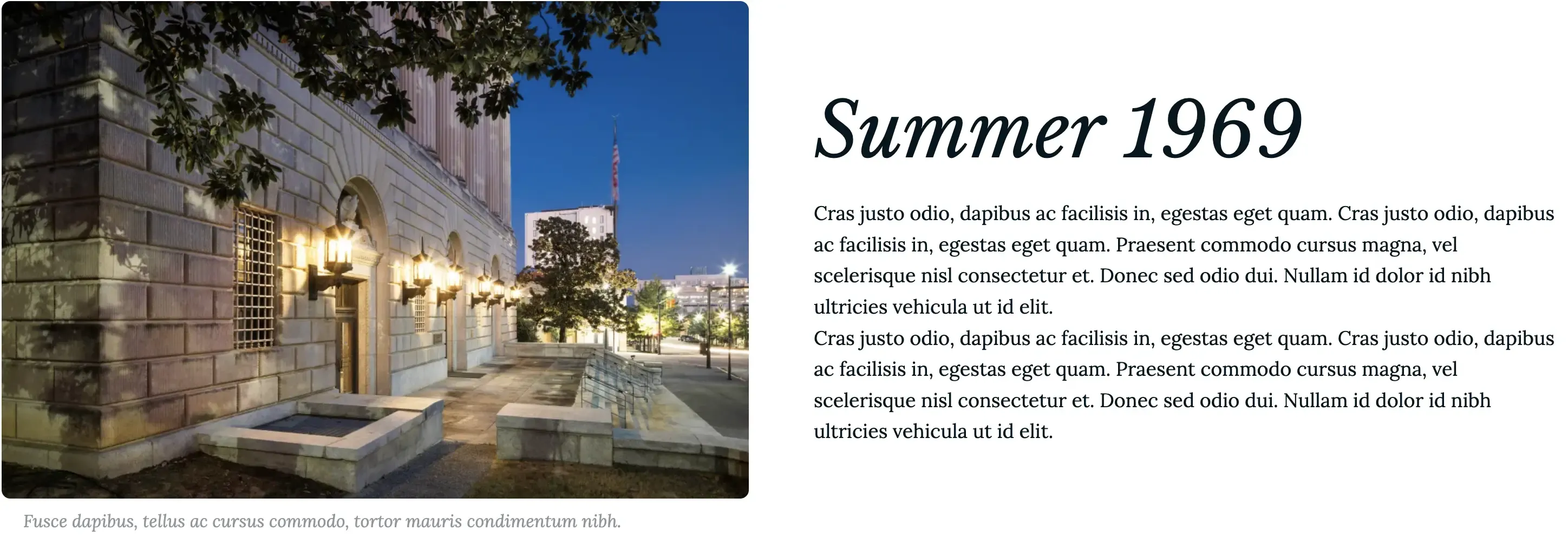
Card with image and text side by side with white background
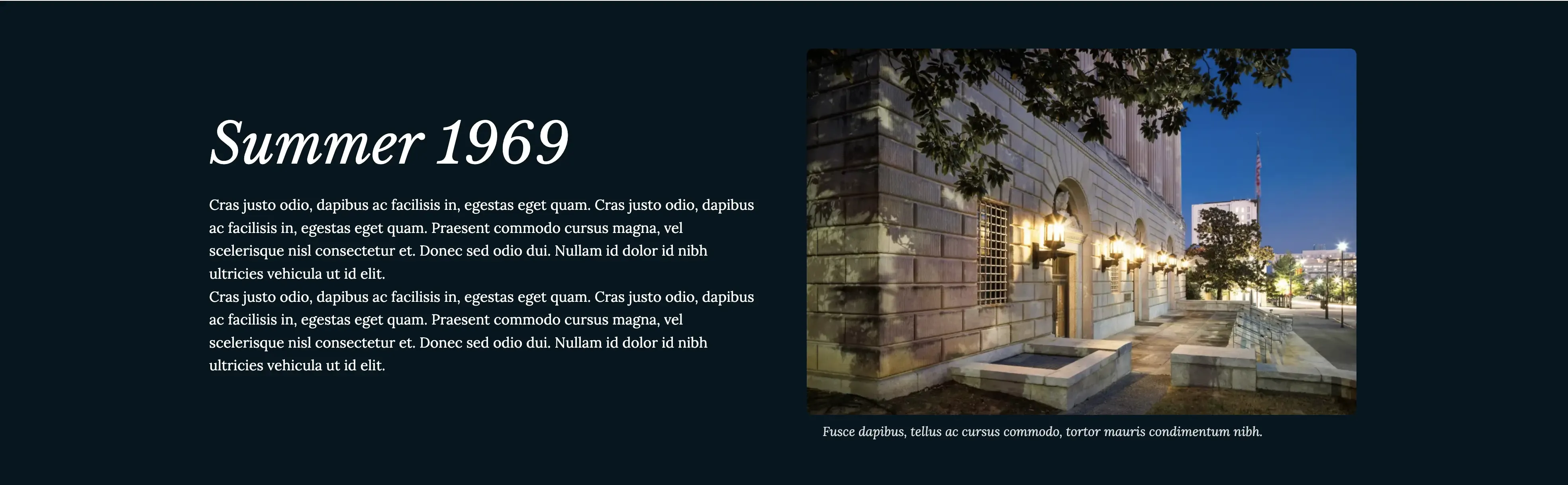
Card with image and text side by side in reversed order with dark background
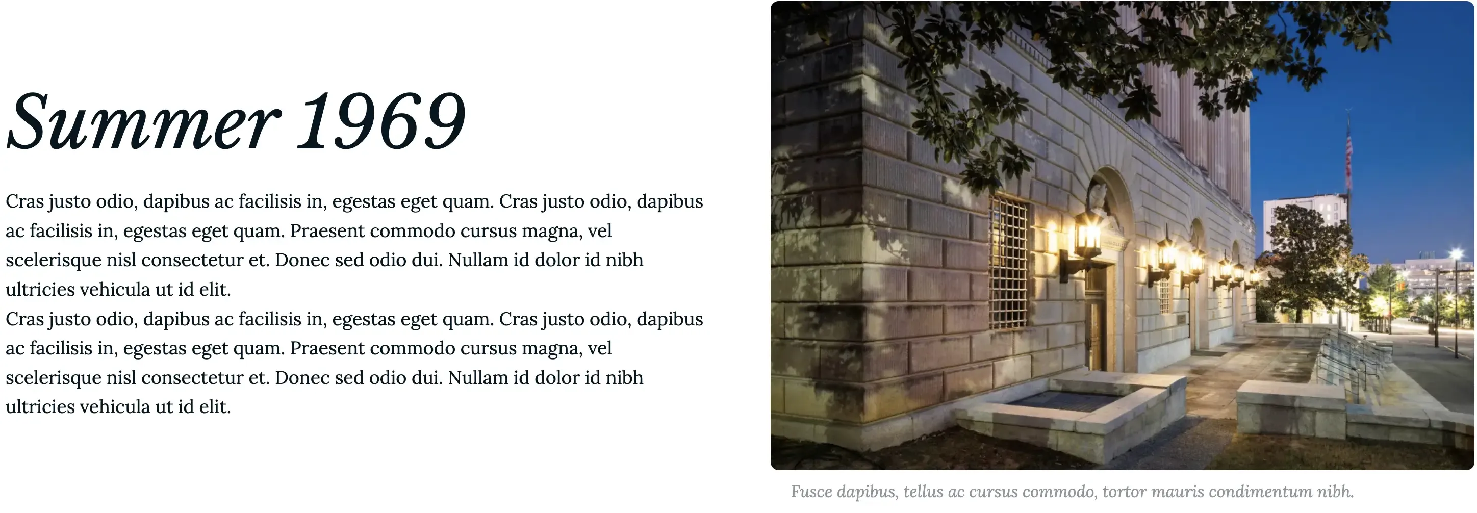
Card with image and text side by side in reversed order with white background
To achieve the various front-end displays shown above, we simply pass a CSS modifier class to the component and write the corresponding styles. But how can content creators choose the display they want during content creation?
The Style Options module
Providing customization options to content editors through a UI typically requires storing data in the database—often by creating new fields, entity view modes, entity references, and more.
The Style options module offers an appealing alternative because it eliminates the need for additional fields or entity view modes. Instead, it stores all configuration options in a YAML file located in the root of your theme or module. The module includes an example file, example.style_options.yml, which provides excellent examples of customization options. It’s worth noting that this is considered a developer-focused module, as it does not provide a UI for configuration.
Install and Configure Style Options
Install and enable the style_options module as you normally do other modules.
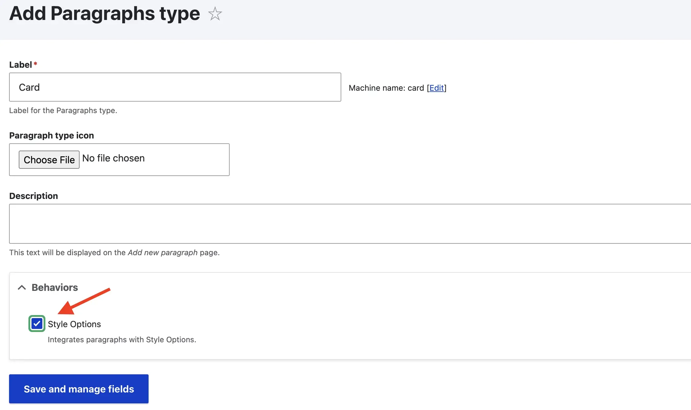
Either create a new paragraph type or edit an existing one you wish to provide styles options to and enable the Style Options behavior as shown in the screenshot below.
Lastly, be sure your paragraph types templates use the
attributesvariable as this is how Style options passes the required attributes such as CSS classes to your templates.
Styles Options configuration example
The Style options module provides three plugins:
- The CSS Class plugin, for attaching custom CSS classes to components.
- The Background Color plugin, for attaching background colors to components.
- The Background Image plugin, for attaching background images to components.
For simplicity of this post, I'll only cover the CSS Class plugin as this is the one I used the most. You should check out the other two plugins though.
Let's take a look at a simple example where provide editors with options to change the side the image appears in the Card component above.
Create the styles option configuration file in the root of your module or theme with the naming convention [module_name].style_options.yml or [theme_name].style_options.yml.
# my_theme.style_options.yml
options:
  image_side:
    plugin: css_class
    label: 'Select the content direction'
    multiple: false
    options:
      -
        label: Select
      -
        label: Image on Left
        class: image-left
      -
        label: Image on Right
        class: image-right
contexts:
  paragraphs:
    _defaults:
      options:
        ...
    my_paragraph:
      options:
        image_side: true
Example of styles to customize a component's border style.
Breaking it all down
options defines the section for all available style options.
image_side is an arbitrary name related to the style you wish to implement. This is only an example. In a real project I would try to use a more general name that could apply to more paragraph types (i.e. content_order, content_direction, etc.).
plugin is one of the three available plugins I described earlier (css_class, background_color, background_image).
label is the label Editors see followed by a set of options.
multiple is a boolean type key which determines if multiple options selection is allowed.
options is an array of available options for Editors to choose from.
labelis the label of an individual optionclassis the actual CSS class you want to pass to the component.Note: If you omit the class key (as in line 9), no class will be passed. This is common when using the first item’s label as the default option in the select field. For example, the word "Select" appears as the default but doesn’t pass any class. See next screenshot.
contexts defines which options should be available for specific contexts (i.e. Paragraph Types, Layouts, etc.)
paragraphs defines a section for paragraph types to make use of the options defined within the options section (line 3). See the project's README for other contexts.
_defaults allows to define any style option as defaults for all paragraphs you choose to use. This avoids repeating the same configuration for each paragraph type.
my_paragraph is the ID for the paragraphs I want to configure with specific options (i.e. image_side).
How are options selections tracked by Drupal?
Earlier, I noted that using Style Options to manage component behavior reduces interaction with Drupal’s configuration and database compared to adding fields or view modes. However, Drupal still tracks the options editors select.
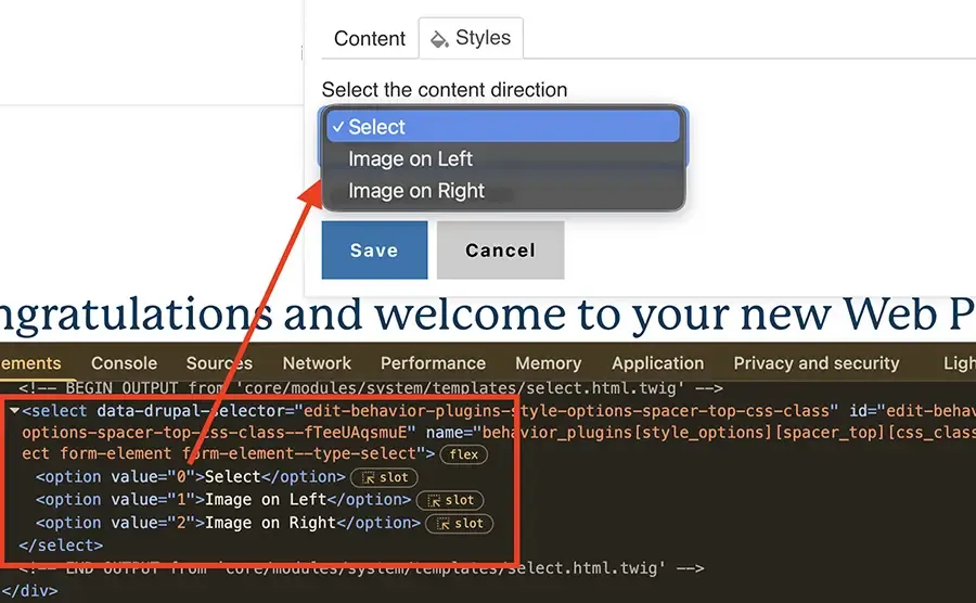
The second options: key (line 7) is a zero-based index array, meaning values start at 0 and increment by order: 0, 1, 2…. Drupal stores these values like any other select field. If you inspect the select field in the edit form, you’ll see each <option> element has a value attribute matching its index. See screenshot.
Example of the select field and its value for style options.
Why is this important?
Since Drupal uses the options index value to track options selected by users, altering this order by rearranging, adding or removing options after it has been in use, will result in components styles and/or behavior not working as expected.
Let's see a quick example using the original configuration we created earlier. I'm omitting all but the necessary code for simplicity.
options:
  -
    label: Select # Index value = 0
  -
    label: Image on Left
    class: image-left # Index value = 1
  -
    label: Image on Right
    class: image-right # Index value = 2
Let's say we want to remove the Image on Left options as it seems redundant because the Card's default state (Image on the left), should require no CSS class.
options:
  -
    label: Select # Index value = 0
  -
    label: Image on Right
    class: image-right # Index value = 1
With this change:
- Cards whose option value used to be
image-left, will now getimage-rightbecause the latter moved from index2to index1, and the card is expecting index1's value. - Cards whose option value used to be
image-right, will no longer get a value because the original index2item (image-right), no longer exists.
As you can probably guess, if Drupal's database is not updated accordingly, the behavior of existing cards will change.
How to solve this issue?
Sometimes, you need to alter a component’s options after its original configuration. When this happens, Drupal’s database must be updated to reflect the correct values. How you handle this is up to you—sometimes a simple preprocessor works, while other cases may require a more complex data migration script.
Keep in mind, this isn’t a Style Options issue; it’s simply how databases and data storage works when fields or options are changed or removed.
In closing
Providing customization options for components offers benefits like better UX and reduced code duplication. However, too many options can overwhelm users and have the opposite effect. Be selective—offer only the essentials to keep the experience simple and effective.
Be sure to learn about the other two plugins the Style options module offers: background image and background color. Also, if you need to improve your layout paragraphs, take a look at the Layout options module.


I welcome your feedback about this post.