Understanding The Owl Selector
A simple yet effective CSS solution for managing content flow in your HTML documents.

With all the advancements in CSS over the past few years, it's surprising to discover a technique that's been available all along. If you're well-versed in CSS, you might already know this little nugget: selector > * + * {...}. Let's dive into it.
Lobotomized Owls 🦉 🦉
The Lobotomized Owl (* + *), or Owl selector, is one of my favorite techniques for managing document flow and achieving consistent spacing in a highly manageable way. While the Owl selector can be used for various style settings, my preferred use is to add spacing between sibling elements.
How does the Owl selector work?
The Owl selector targets elements that are preceded by an immediate sibling. This means that if you apply the Owl selector to a group of HTML elements, the styles will apply to all elements except the first one, as the first one doesn't have a preceding sibling. We'll see some examples shortly.
The Lobotomized Owl isn't a new CSS concept; it's been around since the beginning of CSS and was first discussed back in 2014 when A List Apart wrote about it. Read that article for a more in-depth description of the Owl selector.
Understanding the Owl selector
Concept
The Owl selector allows you to manage the document flow by using the next sibling combinator (+), along with the universal selector (*).
Example
Consider the following HTML:
<div class="parent">
  <div class="child"></div>
  <div class="child"></div>
  <div class="child"></div>
  <div class="child"></div>
</div>
Scoping the Owl selector
Using the Owl selector in its original form (* + *), could result in unexpected updates due to its broad scope. Narrowing the scope is prefered.
Chaining the Owl selector with .parent >:
.parent > * + * {
  margin-block-start: 2rem;
}
Nesting it within .parent along with other rules that may exist:
.parent {
  /* other rules here. */

  > * + * {
    margin-block-start: 2rem;
  }
}
By narrow the scope as shown above, and using the child selector (>), a 2rem top margin is added to "direct" children of .parent, but only if they have a preceding sibling.
Visual example
A more visual representation of what the CSS is doing can be seen here:
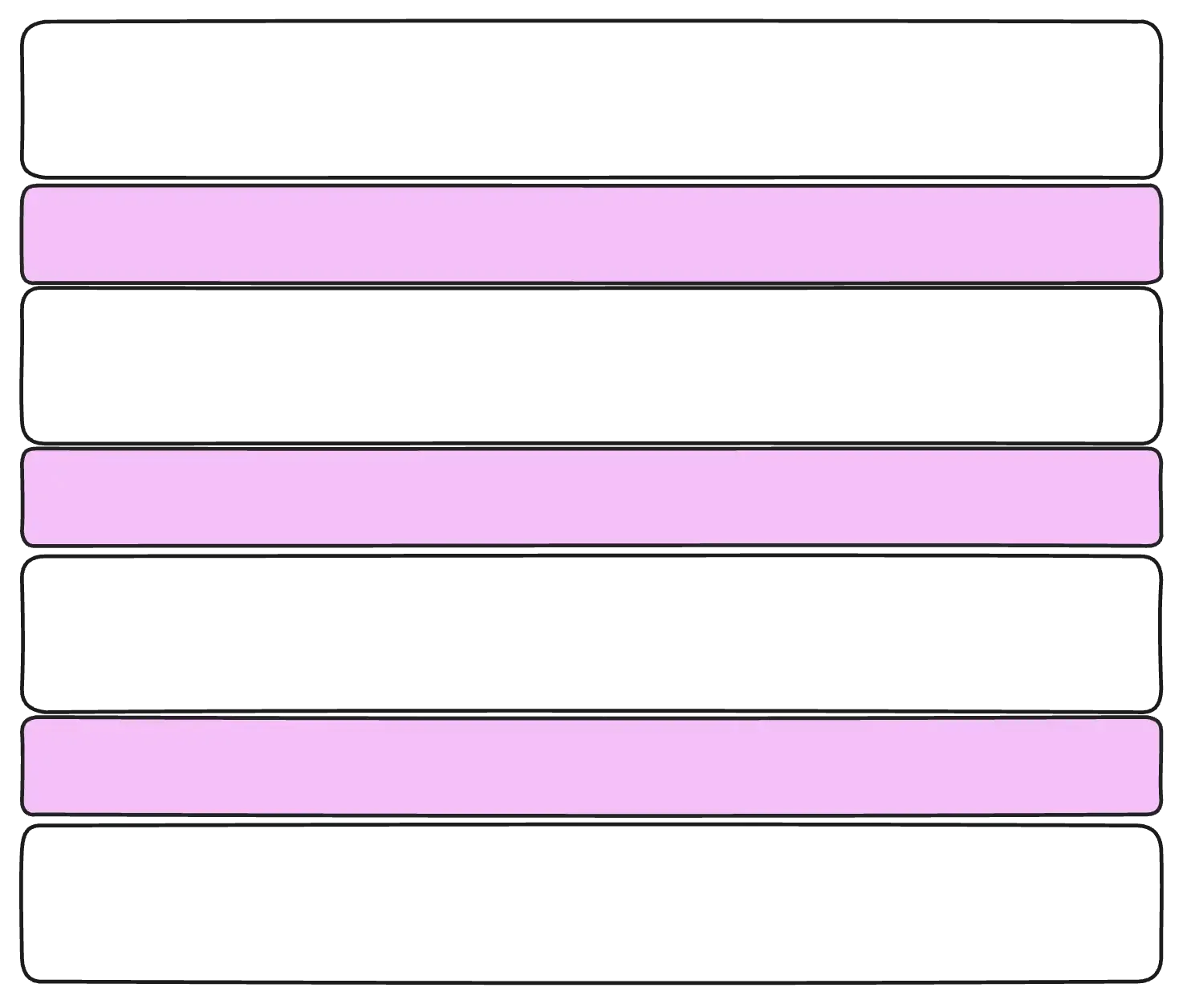
FIG 1: Each white box represents a div while the purple boxes represent top margin.
Instead of writing styles, we’ve created a style axiom: an overarching principle for the layout of content flow. - Heydon Pickering.
Traditional approach for handling margin
In the past I would do something like this to handle margin on a group of elements.
.my-list {
  li:not(:first-child) {
    border-block-start: 1px solid #000;
  }
}
That's not terribly bad, but the problem with this approach is that it increases the specificity of the rule, which could complicate overrides.
Before :not was a thing, I would also do something like this (please forgive me):
.my-list {
  li {
    border-block-start: 1px solid #000;
  }
}

.my-list {
  li:first-child {
    border: 0;
  }
}
There's nothing wrong with this example except that it's more code and you're overriding rules. Ultimately, it works, so don't feel too bad if you've done this. Just don't do it again 😉. Instead, do this:
.my-list {
  > * + * {
    border-block-start: 1px solid #000;
  }
}
A more complex example
The examples above are pretty simple, but in many cases, our HTML may not be as clean or uniform as the examples we've seen. Here's a more realistic example where our markup is a combination of different HTML tags.
<article class="blog-post">

  <div class="blog-post__tag">
    <a href="#" class="eyebrow">Drupal</a>
  </div>

  <header class="blog-post__header">
    <h1 class="blog-post__title">
      Using modern image formats to improve performance
    </h1>
    <p class="blog-post__subtitle">
    Small wins, when added up can make a big difference.
    This is one of those small wins which can result in
    performance gains for your website.</p>
    <div class="blog-post__date">
      <time datetime="2025-xxx-xx">April 12, 2025</time>
    </div>
  </header>

  <div class="blog-post__share">
    <ul class="social-share" role="list">
      <li class="social-share__item">...</li>
      <li class="social-share__item">...</li>
      <li class="social-share__item">...</li>
    </ul>
  </div>

  <div class="blog-post__content">
  ...
  </div>
</article>
The HTML above is actually the code used on each of the blog posts on this site. Let's break it down in an illustration form for a better visual representation.
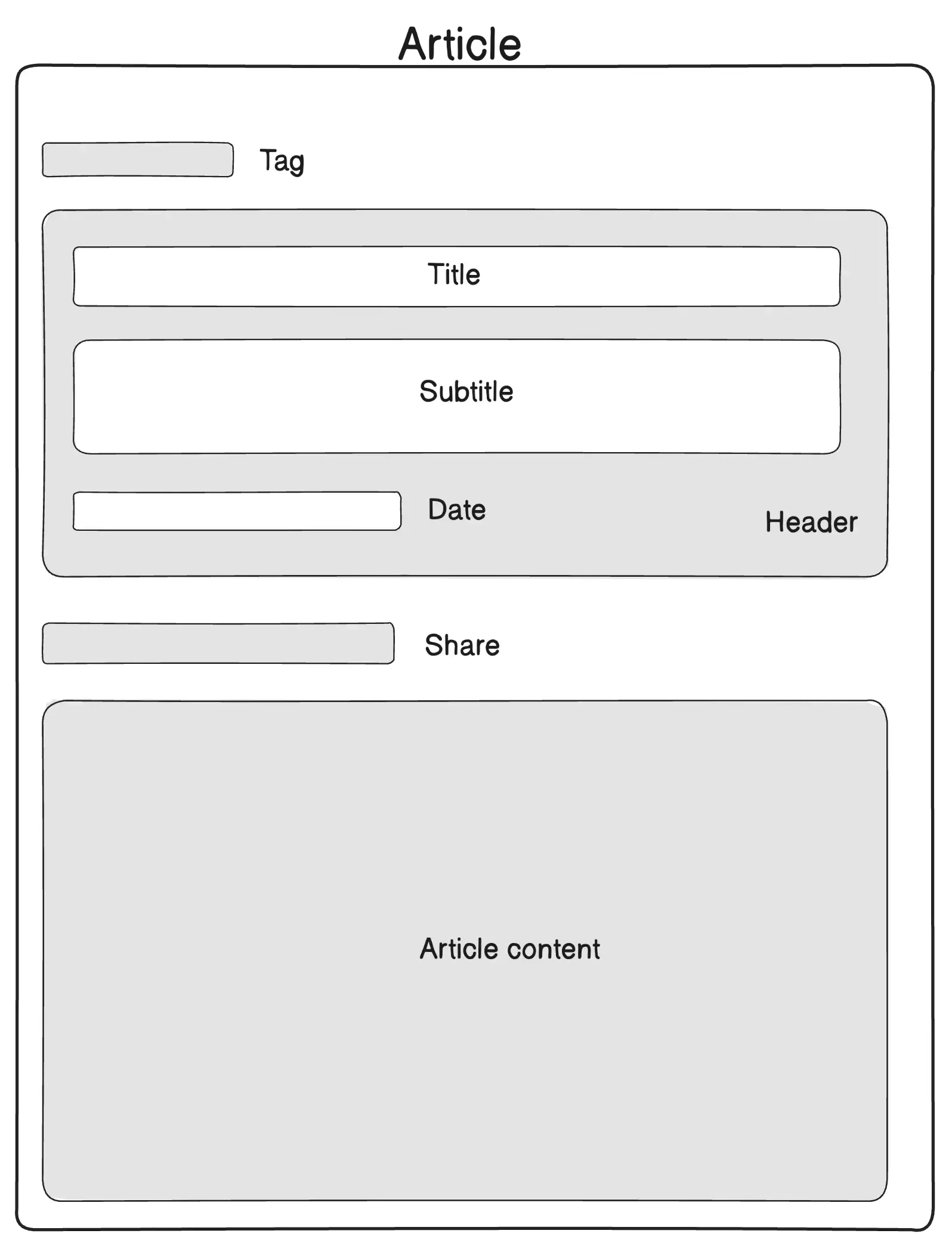
FIG 2. Illustration of the markup structure of a Blog post.
From the code and FIG 2 above, we notice the following:
- The
<article>tag is the top parent element with four direct child elements (Tag, Header, Share, and Article content). - The
<header>tag is also a parent element itself with three direct child elements (Title, Subtitle, and Date). - There is a mix of HTML tags.
Let's start with the <article> parent selector:
.blog-post {
  > * + * {
    margin-block-start: 2rem;
  }
}
The result of this CSS rule is a 2rem top margin on direct sibling children of the .blog-post selector, except the first/top one. I have highlighted in purple how this looks in FIG 3. below:
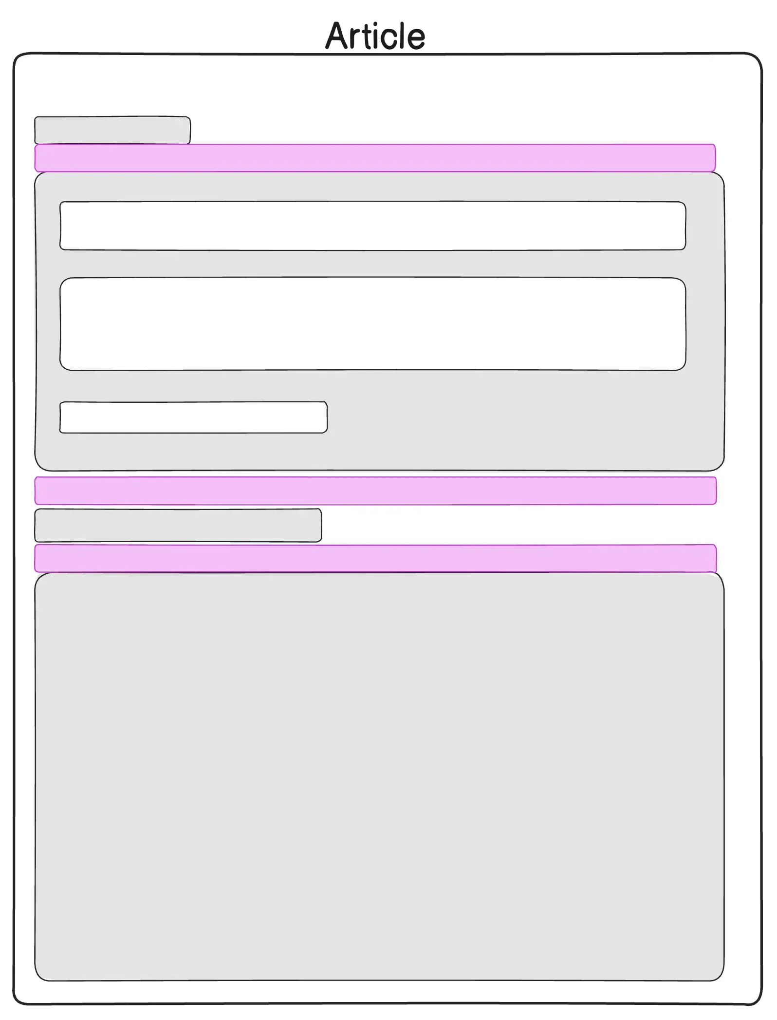
FIG 3. The purple boxes represent the space added by the CSS above.
Now let's apply the same treatment to the <header>:
.blog-post__header {
  > * + * {
    margin-block-start: 2rem;
  }
}
To make it easier to diferentiate, this time I highlighted the margin in direct sibling children of the <header> tag, in blue. See FIG 4. below:
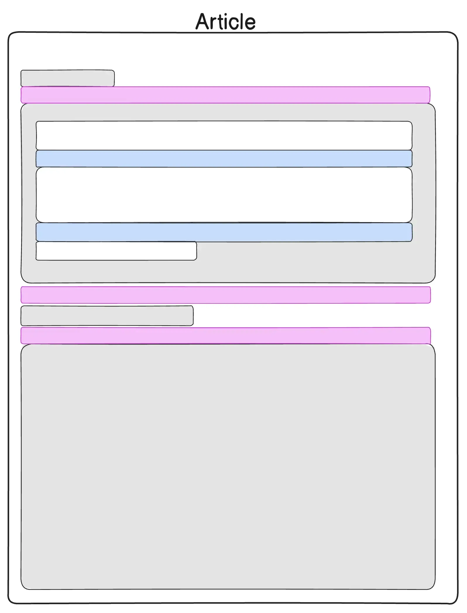
FIG 4. The blue boxes represent the space added by the CSS above.
With very little CSS code we have been able to achieve consistent spacing in direct sibling children of the <article> as well as nested ones inside the <header>. In the spirit of staying DRY, we could even combine both rules to reduce code repitition.
      .blog-post,
      .blog-post__header {
  > * + * {
    margin-block-start: 2rem;
  }
}
What if the HTML structure changes?
It's not uncommon for the HTML of a document to change. Some of my blog posts, for example, have subtitle text while others don't. The beauty of the Owl selector is that it doesn't depend on specific HTML tags or structure in your document. If new sibling elements are added or some are removed, the spacing previously defined with the Owl selector will continue to work as intended without breaking the document flow.
What about Gap?
Oh yes, enough about Owls 🦉, Gap is a beautiful thing and can even be used similarly to the Owl selector for adding space in between sibling child elements.
.parent {
  display: flex;
  flex-direction: column;
  gap: 2rem;
}
Pros of gap
- The CSS block above will behave exactly as the Owl technique, as in it will only add space between sibling child elements.
- Another advantage of using Gap for spacing, is that when it comes to responsive design, the gap rules you apply to elements for mobile, will remain in place as you transition to tablet or desktop. No need to change the gap settings if the direction of your layout has changed. See FIG 5. below.
- Gap is great for menu lists where you may want to add spacing in between each menu item except the ones at the end.

FIG 5. Visual of Gap on column and row mode.
Cons of gap
If you opt to use Gap for spacing, this means you either need to use display: flex or display: grid on the parent element. This is not a bad thing if you are already using flex or grid on that parent element, but if your only reason for using gap is for spacing purposes, then I would recommend using the Owl technique instead as it requires not additional properties on your parent selector.
In closing
I don't think there has ever been a more exciting time to work with CSS than now. The capabilities of CSS and browser support have never been better. Sometimes however, using some of the most basic techniques can make a great impact in our projects.
If you found this post useful, stay tuned for more like it.


I welcome your feedback about this post.