Art Direction using the picture HTML element

In the previous article of this guide we covered the concept of responsive images and some of the challenges that come with implementing an effective system for them. In this article we will go in detail about the concept of "Art Direction" and how this applies to responsive images.
What is art direction?
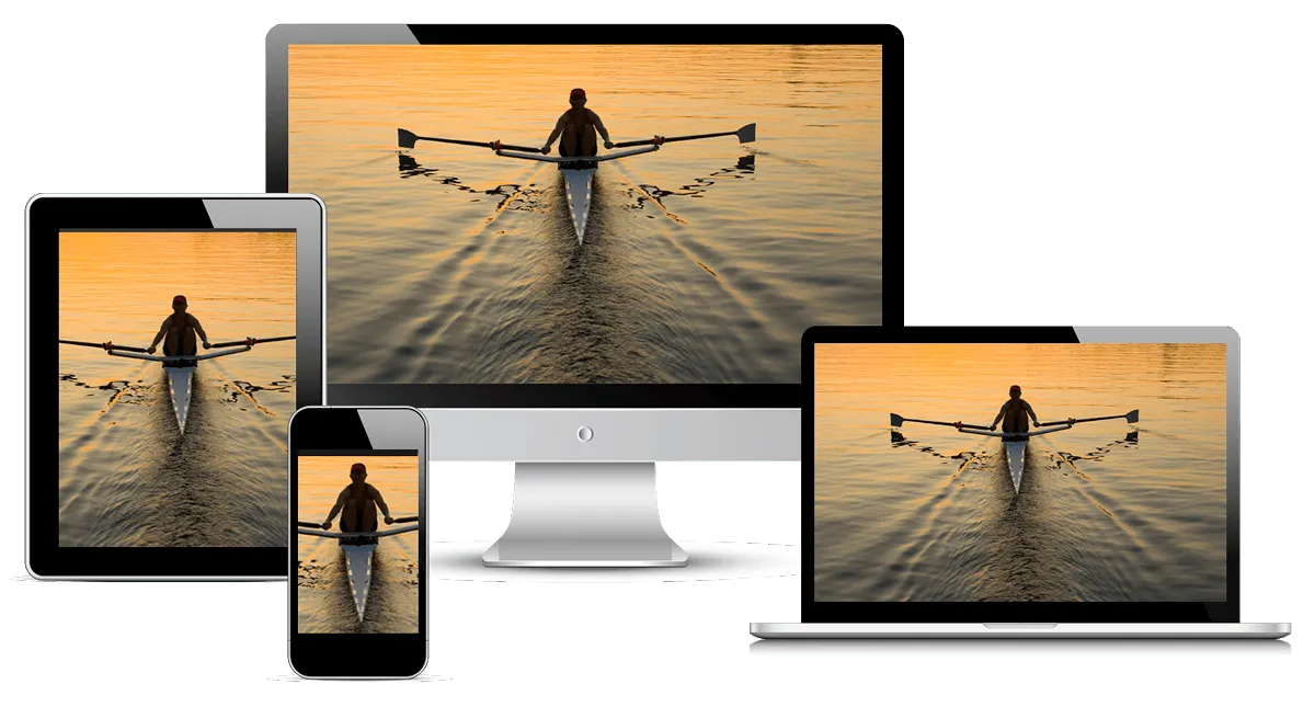
In the context of responsive images, art direction is the ability to display differently-cropped images based on the device size. For example, a large landscape shot of a person rowing in the middle of a lake is shown when viewed on a large desktop device. If we were to use the same image on a mobile device, that image would shrunk down, making the person in the image very small and hard to see. A better option would be to show a different version of the image that zooms in and focuses on the most important part of the image, the person rowing. See an example of this image below.
Enter the <picture> HTML element
In order to achieve art direction we need to be able to query for the size of the device being used to view the website. Once we've identified the device size we instruct the browser which image to use based on the device size. This will allow us to provide a better user experience as each device will display an image intended specifically for that device. Going back to the image above, we can see that the main image has been cropped differently to ensure the most important part of the image is displayed on each divice.
So how do we query for the device size and how do we instruct the browser which image to use? This is where the <picture> element/tag comes in. Let's take a look at the code that makes all this possible and break it down.
<picture>
  <source
    media="(min-width: 2400px)"
    srcset="images/rowing-2400.jpg 1x, images/rowing-4800.jpg 2x"
    type="image/webp">

  <source
    media="(min-width: 1280px)"
    srcset="images/rowing-1400.jpg 1x, images/rowing-2800.jpg 2x"
    type="image/webp">

  <source
    media="(min-width: 640px) and (max-width: 1279px)"
    srcset="images/rowing-1200.jpg 1x, images/rowing-2400.jpg 2x"
    type="images/webp">

  <img
    src="images/rowing-1200.jpg" srcset="images/rowing-2400.jpg 2x"
    alt="Person rowing on a lake" width="1200" height="800">
</picture>Note: The order in which the media queries are written within the <picture> tag matters. The browser will use the first match it finds even if it's not the intended one. Therefore, consider the media query order very carefully to ensure the right image is served.
<picture>: The<picture>tag is simply a wrapper. On its own it does not do anything.<source>: The<picture>HTML element contains zero or more<source>elements. The browser will consider each child<source>element and choose the best match among them. If no matches are found—or the browser doesn't support the<picture>element—the URL of the<img>element's src attribute is selected. The selected image is then presented in the space occupied by the<img>element.- Within the
<source>element, you will find some very handy attributes (media,srcset, andtype):media: Rembember earlier we said we need to query for the device size? Well, within themediaattribute you can write media queries much like the media queries you write in CSS (media="(min-width: 600px)"). This is how we check the size of the device when a page is rendered.srcset: This attribute allows us to provide a list of images the browser can use when the media query finds a match (srcset="img-768.jpg, img-1440.jpg").type: Thetypeattribute specifies a MIME type for the resource URL(s). This is optional if using common image types such as JPG, PNG, TIFF, etc. If you plan on providing images in different file formats, you can do so using thetypeattribute. This is handy in the event the browser does not support a specific file type (type="image/avif"), as you can then provide a supported file type.
<img>: The img element serves two purposes:- It describes the dimensions of the image and its presentation
- It provides a fallback in case none of the offered
<source>elements are able to provide a usable image.
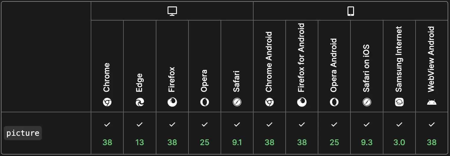
And there you have it. The <picture> element is a great way to serve different images based on things like device size or screen density. When the <picture> element was first introduced it required a pollyfill as not all browsers supported it. Nowadays, unless you are supporting Internet Explorer 11 (sorry bro), all other major browsers provide native support for it. Take a look at the chart below for current browser support.
Great! Let's use <picture> on all our images ...NOOOOOOOO!!!!!!
Say what? If the <picture> element is so great, why can't we use it for rendering all of our images? Well, as great as the <picture> element is, it should not be the default solution for serving responsive images in your site. The only use case for the <picture> element is when you are trying to achieve "Art Direction" (cropping your images differently for each device size).
Remember at the begining of this post when I said "In order to achieve art direction we need to be able to query for the device size. Once we've identified the device size we instruct the browser which image to use..."? There lies the problem. Let me explain.
The issue with the statement above is that "we are telling the browser which image". Not only that, but we are doing so solely based on the size of the device. This may not always be the best way to determine which image a device should use. Imagine you are using a nice relatively new laptop with a super high density screen. Based on our rules established within the <picture> element code snippet above, we would end up with an image that is 4800px in size. This is a pretty large image but it's the one that meets our creteria defined in the media query above. If you're home with a decent wifi connection you will never see any issue loading an image this large, but imagine you are working out of a coffee shop, or at a conference with poor wifi connection, or worse yet, you're on the road using your phone as a hotspot and your signal is very bad, now you will really experience some performance issues because we are telling the browser to load the largest image possible because your computer screen is big (relatively speaking). With the <picture> element we can't check how fast your internet connection is, or whether there are browser preferences a user has configured to account for slow internet speeds. We are basing everything on the size of the device.
Then why use the picture element? Well, when developing a website, the developer does not have all the information they need to serve the best image. Likewise, when rendering a page and using the <picture> tag, the browser does not know everything about the environment. The table below shows this in more detail and exposes the gap between the developer and the browser.
Identifying the gap when using <picture>
| Environment conditions | What the developer knows during development | What the browser knows during image rendering |
|---|---|---|
| Viewport dimensions | No | Yes |
| Image size relative to the viewport | Yes | No |
| Screen density | No | Yes |
| Images dimensions | Yes | No |
You may be wondering: "Why did you get us all excited about the <picture> element if we can't really use it?" well, if you are trying to achieve art direction, then you use the <picture> element. It's the recommended approach for that use case. If you are looking for resolution switching, a use case for most images in the web, you need to use the srcset and sizes attributes approach. In the next post we'll dive deep into this technique.
Navigate posts within this series