Image styles in Drupal
Now that we've gone over some very important concepts of responsive images (art direction and resolution switching), it's time to transfer all that knowledge and put it all in practice in Drupal. One of the key pieces for achieving responsive images in Drupal is by using image styles. Image styles are how Drupal manages the way we crop and size images.
What are image styles?
Before we get to building image styles, let's go over what they are. Think of image styles as templates for cropping, scaling, converting, and sizing images. You can use these templates with any image on your site and as many times as you'd like. Thanks to image styles images will always render within the parameters we define.
A more real-world way of looking at image styles may be if you could imagine for a moment you have a couple of picture frames you'd like to use to hang some pictures in your house or office. One frame is 5x7, another is 4x6 and one last one is 8x10. The picture frames are Drupal's image styles.
So we have some picture frames and we have ordered several pictures from our favorite online photo printing service. There is one picture in particular I really love and I want to frame it using the 3 picture frames. So, although it is the same picture, I ordered different sizes of it (one for each frame size), and this will allow me to hang the 3 pictures in different sizes, aspect ratios and orientation. That in a nutshell are image styles.
Image styles best practices
Image styles are actually pretty easy to create but unfortunately because of this they can be misused or mismanaged. If not done properly, you may end up with a lot more image styles than you really need or image styles that are not well define and do no provide the outcome you are looking for. To avoid this, let's go over best practices for creating image styles which will result in less image styles to manage. Mind you, these are my best practices but I have to admit, they have worked very well for me.
Naming image styles
Have you heard the phrase "naming things is hard"? It's true. Unfortunately when it comes to image styles, if not named properly you can get yourself in a lot of trouble. Quick example, let's say I want to create an image style that I'd like to use on images of news articles that are displayed on the homepage. One might think a good name for the image style may be something like "Homepage news article images". It doesn't seem so bad but let me point out a few issues with this name:
- The image style is limited to the homepage
- It is limited to news article images
- It lacks information about the image dimensions or aspect ratio
One objective with image styles is to create them in a way that they are reusable. The more reusable an image style is the less image styles you will need to create which in turn becomes easier to manage. The main issue with the image style above ("Homepage news article images"), besides the 3 bullet points we called out, is that is not reusable. The name of it limits us to only use it on the homepage and only for news article images. If we want to display similar images elsewhere, we would need to create another image style maybe with the same parameters as the first one. You may be asking yourself, wait, why can't we use the same image style elsewhere? Technically you can, but think about how confusing it will be to use an image style called "Homepage news article images", not on the homepage and not on news article images.
Creating reusable image styles
One very efficient way for creating reusable image styles is to name them based on the image aspect ratio or dimensions, or a combination of both. For example: "16:9 (Max 320px)", or "Box 1:1 (500px)". Here are some reasons why this is a great way to name image styles:
- They are not specific to any page or type of image (articles, events, etc.)
- They provide key information about the image aspect ratio and their dimensions
- I can use these image styles hundreds of times on any image that fits the requirements as well as on any page
- By creating/naming image styles this way, I may have just saved myself from creating many other image styles
Identifying the images patterns
I have found one of the most effective ways for identifyiing the image styles you need to create is by looking at your website mockups (if you are fortunate enough to have them). This may not always be possible, but if you do have designs for your website, this will tell you exactly which images you will need and how they need to be rendered. Having this information upfront will help you tremendously when creating image styles because you can plan ahead of time how to create reusable image styles that share commom attributes.
Image styles use cases
When naming image styles it helps me to think of the characteristics of the images I am creating image styles for. For example, I have an image that should be rendered in 16:9 aspect ratio and it should not exceed a width of 320px. This is how I arrived at the name 16:9 (Max 320px). This also makes it possible to know which image style to use if I have other images that need to be rendered similarly. By the way, it is perfectly okay to use an image style that is slightly off from what an image needs to be rendered at. For example, Let's say I have an image that should be rendered at 16:9 aspect ratio, but its size should not exceed 250px. for this image, I can still use the 16:9 (Max 320px) image style.
A 100px or even 200px difference between the image style dimensions and the image you need to use it on it's an acceptable thing to do for a couple of reasons:
- 100 or 200px in most cases will not make a big of an impact in performance, however, if you are rendering 50 of these images in a single page, then this could certainly present performance issues. So my rule is as long as this is a oneoff type of situation, I'm okay with doing this.
- Keep in mind that just because your image may be resized larger than it actually needs to be rendered, your image will still visually rendered at the right size as I would suppose it is inside a container that will be sized to the right rendering size, via CSS.
- Being able to reuse an image style that may be slightly larger than needed saves me from creating more image styles.
I hope you see the impact good names for image styles have on your site. When you are working on an enterprise level website, using the best practices above can really help you with the maintenance of your image styles.
Image styles effects
Effects are the rules you set on each image style. Rules such as cropping, sizing, converting, saturating, rotating, and scaling of images is how we determine how to render the images in our site. In most cases, you want to let content creators of your site upload images that are relatively big. Doing so will allow you to use the images in your library in any use case. It is perfectly okay to scale your images down thorugh the use of image styles, but it is not recommended to scale images up. Doing so will result in blurry or pixelated images. This is why is better to upload large images. But you may be thinking, if I upload super large images, this will affect the performance of my site. It will if you are rendering the original images, but since we are using image styles, Drupal uses the original image to make copies at the size and aspect ratio you defined in your image styles. This is why by uploading a single image you are able to use it in many use cases at different sizes or aspect ratios.
Image styles effects can vary from image style to image style. For example, some image styles will require images to be scaled down, then cropped. Others will require images to be resized then cropped and others may just need for images to be resized to specific size. All these actions are called "Effects" in image styles. The effects you apply to your image styles will depend on the end goal for rendering the images. Let's do a quick demo of creating one image styles then applying effects to it.
Hands-on excercise
All the principles covered in this series apply to Drupal 8, 9, and 10. You can follow along or simply watch me do it. To get started, spin up a vanilla Drupal site of the version of your choice. At the begining of this series I mentioned we will stick with only core/out of the box functionality to keep things simple.
Creating a new image style
- Login to Drupal as administrator
- In your Drupal site navigate to
/admin/config/media/image-styles - Click Add image style
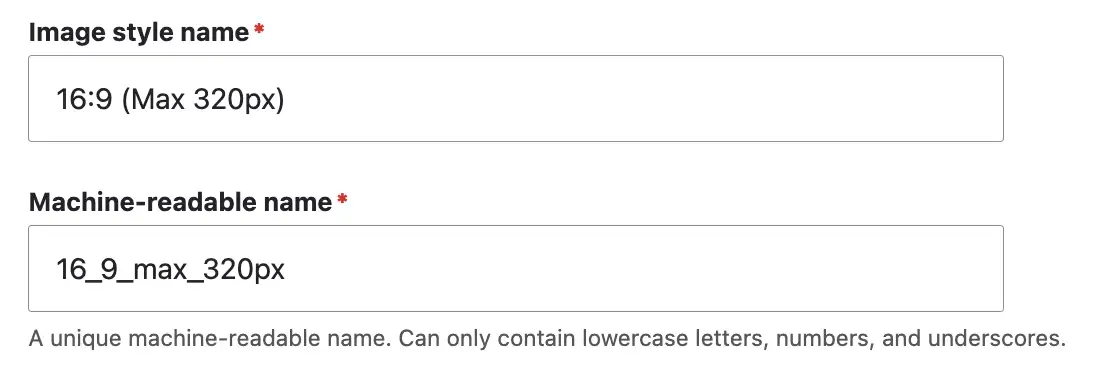
- For Image style name type: 16:9 (Max 320px)
- To keep things nifty, edit the image style machine name so it reads
16_9_max_320px. (Remove the trailing underscore generated by the ending parenthesis in the image style name. Clean machine names are important to me 😃. It actually makes a difference when you are debugging issues and you find your machine name has an extra underscore you didn't catch). - Click Create new style
The image style above follows the best practices for name we covered earlier. This makes this image style reusable on any image that meets the aspect ratio and dimension requirements.
Adding effects to the image style
For the purpose of this exercise, we are going to use the Scale and crop effect. This is probably the effect I use the most because it does exactly what I want, scale the image down to the size I want and crop it in the aspect ratio I need.
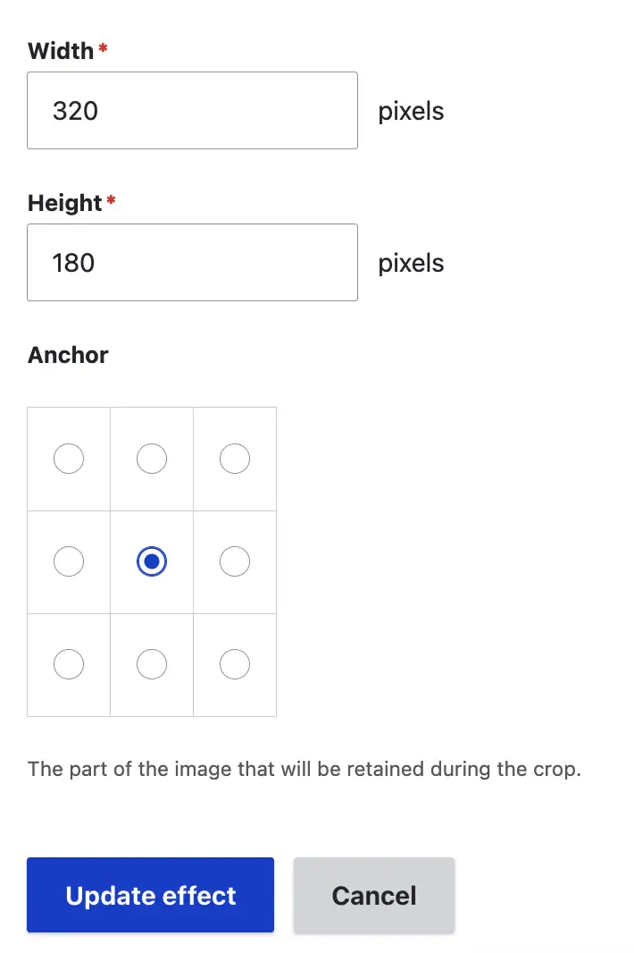
- While in the page where the new image style was created (/admin/config/media/image-styles/manage/16_9_max_320px), scroll down and you should see the Effect dropdown
- Select Scale and crop from the dropdown
- Click Add. The Add Scale and Crop effect screen will come up
- Type 320 for width and 180 for height. Note: These two values are required when you select the scale and crop effect. In other effects, these values may not always be required. It is important to define fixed dimensions on your image styles. This ensures your images will be sized/cropped at exactly the size you expect them to. How did I figure out the height for a 16:9 image with a width of 320px is 180px? I used this online aspect ratio calculator.
- Notice how you can change the focal point of the cropping by clicking any of the circles under Anchor. For this example we'll keep it in the middle circle.
- Click Update effect. This will bring you back to the image style page.
- We're done!
Now we have one custom image style with specific effects. If you noticed, Drupal comes with a couple of predefined image styles. If they work for your images you should make use of them. In this series we will be creating custom image styles.
As I mentioned earlier, names of image styles should be descriptive but not limiting. In the case of some of the image styles that come out of the box with Drupal, the names Large, Medium, and Wide do not seem like good choices for names because those names are all relative. Large in relation to what? Medium in relation to what? ...just sayin'.
Image multipliers
One thing we have not discussed but it is very important in responsive images, is the use of "Image Multipliers". What are image multipliers? In responsive images, you often think of image sizes in natural dimensions. If I think of an image that needs to be rendered at 720px, I will most likely resize or crop that image at 720px which makes total sense. With the evolution of high density or high resolution (retina) screens on mobile and larger devices, because they contain thousands or millions more pixels than traditional resolution screens, images need to actually be bigger than the intended size so they are rendered at their highest resolution/quality. This is what image multipliers are.
If we go back to the example above of the 720px image. For this image to be rendered as sharp and high-quality as possible in retina screen devices, we should add a 2x or 3x multiplier to it. Meaning, we should create an image styles for this image at twice and three times the intended size (1440px, 2160px). When we do this, the image will still be rendered at 720px (visually), but because we are providing larger images, these images will have twice or three times the number of pixels within them and when viewed in high resolution screens, the image quality will be superior than if we are only providing a regular 720px image. Note: I typically only create a 2x multiplier image styles for most of my images, but there may be situation when there are specific requirements for creating a 3x multiplier image styles.
Create a 2x multiplier image style
The same way you created the original image style above for 16:9 (Max 320px), go ahead and repeat the process but this time create a 2x multiplier image style, 16:9 (Max 640px). Remember, the dimensions of this image style should be 640 x 360px.
So what's next?
With our custom image styles in place, we can now make use of them, but before we do, let's go over another very important concept within Drupal, Responsive image styles ...whaaaaatttt?
We'll comeback to Drupal in a bit but first, we'll talk about responsive image styles in the next post.
Navigate posts within this series