Building a modern Drupal theme with Storybook

Building a custom Drupal theme nowadays is a more complex process than it used to be. Most themes require some kind of build tool such as Gulp, Grunt, Webpack or others to automate many of the repeatitive tasks we perform when working on the front-end. Tasks like compiling and minifying code, compressing images, linting code, and many more. As Atomic Web Design became a thing, things got more complicated because now if you are building components you need a styleguide or Design System to showcase and maintain those components. One of those design systems for me has been Patternlab. I started using Patternlab in all my Drupal projects almost ten years ago with great success. In addition, Patternlab has been the design system of choice at my place of work but one of my immediate tasks was to work on migrating to a different design system. We have a small team but were very excited about the challenge of finding and using a more modern and robust design system for our large multi-site Drupal environment.
Disclaimer: Due to technical restrictions and project requirements, we were not able to use Single Directory Components or SDC, nor the Storybook module. Our front-end environment was custom built from the ground up.
Enter Storybook
After looking a various options for a design system, Storybook seemed to be the right choice for us for a couple of reasons: one, it has been around for about 10 years and during this time it has matured significantly, and two, it has become a very popular option in the Drupal ecosystem. In some ways, Storybook follows the same model as Drupal, it has a pretty active community and a very healthy ecosystem of plugins to extend its core functionality.
Storybook looks very promising as a design system for Drupal projects and with the recent release of Single Directory Components or SDC, and the new Storybook module, we think things can only get better for Drupal front-end development. Unfortunately for us, technical limitations in combination with our specific requirements, prevented us from using SDC or the Storybook module. Instead, we built our environment from scratch with a stand-alone integration of Storybook 8.
Our process and requirements
In choosing Storybook, we went through a rigorous research and testing process to ensure it will not only solve our immediate problems with our current environment, but it will be around as a long term solution. As part of this process, we also tested several available options like Emulsify and Gesso which would be great options for anyone looking for a ready-to-go system out of the box. Some of our requirements included:
1. No components refactoring
The first and non-negotiable requirement was to be able to migrate components from Patternlab to a new design system with the least amount of refactoring as possible. We have a decent amount of components which have been built within the last year and the last thing we wanted was to have to rebuild them again because we are switching design system.
2. A new Front-end build workflow
I personally have been faithful to Gulp as a front-end build tool for as long as I can remember because it did everything I needed done in a very efficient manner. The Drupal project we maintain also used Gulp, but as part of this migration, we wanted to see what other options were out there that could improve our workflow. The obvious choice seemed to be Webpack, but as we looked closer into this we learned about ViteJS, "The Next Genration Frontend Tooling". Vite delivers on its promise of being "blazing fast", and its ecosystem is great and growing, so we went with it.
3. No more Sass in favor of PostCSS
CSS has drastically improved in recent years. It is now possible with plain CSS, to do many of the things you used to be able to only do with Sass or similar CSS Preprocessor. Eliminating Sass from our workflow meant we would also be able to get rid of many other node dependencies related to Sass. The goal for this project was to use plain CSS in combination with PostCSS and one bonus of using Vite is that Vite offers PostCSS processing out of the box without additional plugins or dependencies. Ofcourse if you want to do more advance PostCSS processing you will probably need some external dependencies.
Building a new Drupal theme with Storybook
Let's go over the steps to building the base of your new Drupal theme with ViteJS and Storybook. This will be at a high-level to callout only the most important and Drupal-related parts. This process will create a brand new theme. If you already have a theme you would like to use, make the appropriate changes to the instructions.
1. Setup Storybook with ViteJS
ViteJS
- In your Drupal project, navigate to the theme's directory (i.e.
/web/themes/custom/) - Run the following command:
npm create vite@latest storybook
# replace storybook with a name of your choice.- When prompted, select the framework of your choice, for us the framework is React.
- When prompted, select the variant for your project, for us this is JavaScript
After the setup finishes you will have a basic Vite project running.
Storybook
- Be sure your system is running NodeJS version 18 or higher
- Inside the newly created theme, run this command:
npx storybook@latest init --type react- After installation completes, you will have a new Storybook instance running
- If Storybook didn't start on its own, start it by running:
npm run storybookTwigJS
Twig templates are server-side templates which are normally rendered with TwigPHP to HTML by Drupal, but Storybook is a JS tool. TwigJS is the JS-equivalent of TwigPHP so that Storybook understands Twig. Let's install all dependencies needed for Storybook to work with Twig.
- If Storybook is still running, press Ctrl + C to stop it
- Then run the following command:
npm i -D vite-plugin-twig-drupal html-react-parser twig-drupal-filters @modyfi/vite-plugin-yaml- vite-plugin-twig-drupal: If you are using Vite like we are, this is a Vite plugin that handles transforming twig files into a Javascript function that can be used with Storybook. This plugin includes the following:
- Twig or TwigJS: This is the JavaScript implementation of the Twig PHP templating language. This allows Storybook to understand Twig.
Note: TwigJS may not always be in sync with the version of Twig PHP in Drupal and you may run into issues when using certain Twig functions or filters, however, we are adding other extensions that may help with the incompatability issues. - drupal attribute: Adds the ability to work with Drupal attributes.
- Twig or TwigJS: This is the JavaScript implementation of the Twig PHP templating language. This allows Storybook to understand Twig.
- twig-drupal-filters: TwigJS implementation of Twig functions and filters.
- html-react-parser: This extension is key for Storybook to parse HTML code into react elements.
- @modifi/vite-plugin-yaml: Transforms a YAML file into a JS object. This is useful for passing the component's data to React as args.
ViteJS configuration
Update your vite.config.js so it makes use of the new extensions we just installed as well as configuring the namesapces for our components.
import { defineConfig } from "vite"
import yml from '@modyfi/vite-plugin-yaml';
import twig from 'vite-plugin-twig-drupal';
import { join } from "node:path"
export default defineConfig({
  plugins: [
    twig({
      namespaces: {
        components: join(__dirname, "./src/components"),
        // Other namespaces maybe be added.
      },
    }),
    // Allows Storybook to read data from YAML files.
    yml(),
  ],
})
Storybook configuration
Out of the box, Storybook comes with main.js and preview.js inside the .storybook directory. These two files is where a lot of Storybook's configuration is done. We are going to define the location of our components, same location as we did in vite.config.js above (we'll create this directory shortly). We are also going to do a quick config inside preview.js for handling drupal filters.
- Inside .storybook/main.js file, update the stories array as follows:
stories: [
  "../src/components/**/*.mdx",
  "../src/components/**/*.stories.@(js|jsx|mjs|ts|tsx)",
],- Inside .storybook/preview.js, update it as follows:
/** @type { import('@storybook/react').Preview } */
import Twig from 'twig';
import drupalFilters from 'twig-drupal-filters';

function setupFilters(twig) {
  twig.cache();
  drupalFilters(twig);
  return twig;
}

setupFilters(Twig);

const preview = {
  parameters: {
    controls: {
      matchers: {
        color: /(background|color)$/i,
        date: /Date$/i,
      },
    },
  },
};

export default preview;
Creating the components directory
- If Storybook is still running, press Ctrl + C to stop it
- Inside the src directory, create the components directory. Alternatively, you could rename the existing stories directory to components.
Creating your first component
With the current system in place we can start building components. We'll start with a very simple component to try things out first.
- Inside src/components, create a new directory called title
- Inside the title directory, create the following files: title.yml and title.twig
Writing the code
- Inside title.yml, add the following:
---
level: 2
modifier: 'title'
text: 'Welcome to your new Drupal theme with Storybook!'
url: 'https://mariohernandez.io'- Inside title.twig, add the following:
<h{{ level|default(2) }}{% if modifier %} class="{{ modifier }}"{% endif %}>
  {% if url %}
    <a href="{{ url }}">{{ text }}</a>
  {% else %}
    <span>{{ text }}</span>
  {% endif %}
</h{{ level|default(2) }}>
We have a simple title component that will print a title of anything you want. The level key allows us to change the heading level of the title (i.e. h1, h2, h3, etc.), and the modifier key allows us to pass a modifier class to the component, and the url will be helpful when our title needs to be a link to another page or component.
Currently the title component is not available in storybook. Storybook uses a special file to display each component as a story, the file name is component-name.stories.jsx.
- Inside title create a file called title.stories.jsx
- Inside the stories file, add the following:
/**
 * First we import the `html-react-parser` extension to be able to
 * parse HTML into react.
 */
import parse from 'html-react-parser';

/**
 * Next we import the component's markup and logic (twig), data schema (yml),
 * as well as any styles or JS the component may use.
 */
import title from './title.twig';
import data from './title.yml';

/**
 * Next we define a default configuration for the component to use.
 * These settings will be inherited by all stories of the component,
 * shall the component have multiple variations.
 * `component` is an arbitrary name assigned to the default configuration.
 * `title` determines the location and name of the story in Storybook's sidebar.
 * `render` uses the parser extension to render the component's html to react.
 * `args` uses the variables defined in title.yml as react arguments.
 */
const component = {
  title: 'Components/Title',
  render: (args) => parse(title(args)),
  args: { ...data },
};

/**
 * Export the Title and render it in Storybook as a Story.
 * The `name` key allows you to assign a name to each story of the component.
 * For example: `Title`, `Title dark`, `Title light`, etc.
 */
export const TitleElement = {
  name: 'Title',
};

/**
 * Finally export the default object, `component`. Storybook/React requires this step.
 */
export default component;- If Storybook is running you should see the title story. See example below:
- Otherwise start Storybook by running:
npm run storybookWith Storybook running, the title component should look like the image below:
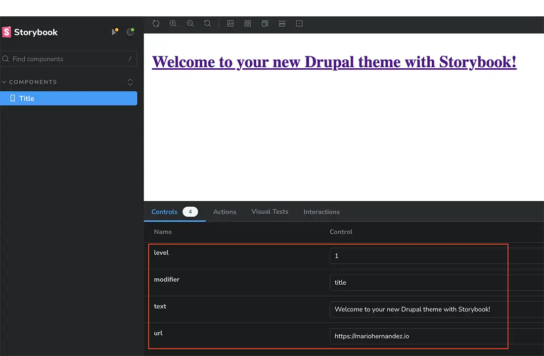
The controls highlighted at the bottom of the title allow you to change the values of each of the fields for the title.
I wanted to start with the simplest of components, the title, to show how Storybook, with help from the extensions we installed, understands Twig. The good news is that the same approach we took with the title component works on even more complex components. Even the React code we wrote does not change much on large components.
In the next blog post, we will build more components that nest smaller components, and we will also add Drupal related parts and configuration to our theme so we can begin using the theme in a Drupal site. Finally, we will integrate the components we built in Storybook with Drupal so our content can be rendered using the component we're building. Stay tuned. For now, if you want to grab a copy of all the code in this post, you can do so below.
Resources
In closing
Getting to this point was a team effort and I'd like to thank Chaz Chumley, a Senior Software Engineer, who did a lot of the configuration discussed in this post. In addition, I am thankful to the Emulsify and Gesso teams for letting us pick their brains during our research. Their help was critical in this process.
I hope this was helpful and if there is anything I can help you with in your journey of a Storybook-friendly Drupal theme, feel free to reach out.