Image resolution switching using srcset and sizes attributes

In the previous article we defined what art direction is and how to address it using the <picture> element. In this post, the focus will be how to address responsive images when the requirement is image resolution switching. Resolution switching, in the context of responsive images, is rendering identical image content on all devices. Unlike art direction where each device gets a differently cropped image that may vary on aspect ratio, resolution switching uses images that are simply larger or smaller based on the device but retain the same aspect ratio and cropping settings. Resolution switching is how most images are rendered (the rule), the <picture> element approach is the exception to the rule. Take a look at an example of resolution switching below.
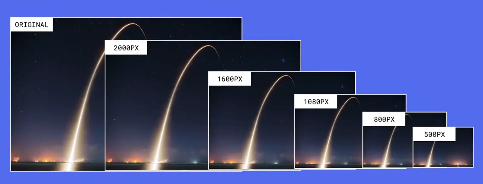
The image above demonstrate how multiple resolutions of the same image can be served to different devices. All the images in the example above are cropped exactly the same maintaining the same aspect ratio from large to small.
Using srcset and sizes attributes
Using the srcset and sizes image attributes is how most images are rendered in the web today. As indicated before, this is the recommended way for configuring responsive images if all you need is to switch resolution of images rather than art direction. So how does this approach work? Let's take a look at a typical configuration of the <img> tag using the image above as an example of the different image sizes we will want the browser to choose from:
<img
  srcset="original-image.jpg 2400w, extra-large.jpg 2000w,
          large.jpg 1600w, medium.jpg 1080w, small.jpg 800w, x-small.jpg 500w"
  sizes="100vw"
  src="large.jpg"
  alt="Image of sky shown at different resolutions" />
Let's break things down so we can understand this approach better.
<img>: Right off the bat we start by using a widely supported html tag.srcset: Thesrcsetattribute in the img tag serves two important roles, 1) It stores a list of images that can be used by the browser, 2) Each image provides its width value which plays a role on the browser choosing the right image.sizes: Thesizesattribute tells the browser the width, in relation to the viewport, the image should be rendered at. The value of100vwshown above, means the image will be rendered at 100% the viewport width on all the devices. You could also use media queries like(max-width: 720px) 100vw, 50vw. This means that if the device does not exceed 720px in width, the image will be rendered at 100% the viewport width, otherwise (if the device is larger than 720px), the image will be rendered at 50% the viewport width.src: Thesrcattribute is used as a fallback if everything fails.
What does it all mean?
Let me explain things in more detail because it is important we understand how this approach is so much better than using the <picture> element.
The biggest difference/advantage of using srcset and sizes versus <picture>, is the fact that we let the browser decide which image is the best image to render on any device. This is possible thanks to all the information we have supplied to the browser. For example, in the srcset we are not only providing the browser with a list of images to choose from, but we are also telling the browser how big each image is. This is very important because the browser will use this information when choosing the image to render. In the <picture> element approach, the image size descriptors are not available.
The sizes value tells the browser the size the image needs to be rendered at in relation to the viewport. This too is extremely important information we are providing the browser because if the browser knows the dimensions of all the images to choose from and how big/small the image needs to be rendered, then the browser is able to pick the best image possible.
But that's not all, the browser is smarter and knows more about the web environment than we do when a page or image is rendered. For example, the browser knows the viewport width used when viewing a website, it knows how fast/slow your internet connection is, and it knows about any browser preference settings (if any), setup by the user. Using all this information the browser is able to determine which image from the srcset is the best to use. In contrast, with the <picture> element, we tell the browser which image to use solely based on the device size.
Closing the gap
Now let's see how using the srcset and sizes attributes closes the gap we identified when using the <picture> tag.
| Environment conditions | What the developer knows during development | What the browser knows during image rendering |
|---|---|---|
| Viewport dimensions | No | Yes |
| Image size relative to the viewport | Yes | sizes |
| Screen density | No | Yes |
| Images dimensions | Yes | srcset |
Pretty nice huh? Now thanks to the srcset and sizes attributes we've closed the gap and the browser has all the information it needs to ensure the best image is served to each device.
The next post of this series will focus on image styles. These are fun but can also get you in a lot of trouble if not properly done. See you there.
In closing
Time for a story: I recently did an experiment that 100% proves the use of resolution switching using srcset and sizes attributes. As most people nowadays, I use a very large second display when working on projects to fit more apps and see things better. My second display is nice but it's not a 4K display. It's double the physical size of my mac's screen, but the mac's screen resolution is higher by almost double (twice the number of pixels). When I look at an image of a project where I've implemented the practices in this guide, in the large display, and inspected the page, I see the browser has selected an image that is 720px which makes complete sense for the use case I am testing. I then unplugged the second display and viewed the page on my mac's screen (higher resolution), I reloaded the page and inspected it, I noticed the browser has now selected an image that is double the size of the first image. This is exactly the behavior I would expect because my mac screen is of higher resolution and my connection speed is very fast. So the browser was able to make the smart decision to use a different images based on my environment.
Navigate posts within this series