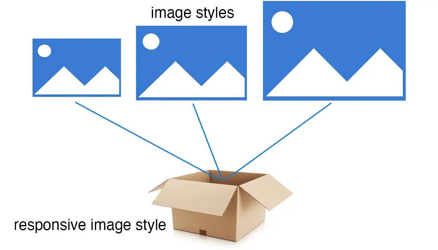
Responsive image styles
In a nutshell, responsive image styles are a collection of image styles. It can be confusing because the similarities in their names, but responsive image styles are a bundle that holds one or more image styles.
What's the use of responsive image styles?
If you read the posts about the <picture> element as well as the one about srcset and sizes attributes, we discussed that whether you are doing art direction or resolution switching, we need to provide the browser with a collection of images to serve to different devices. In Drupal the way we provide the collection of images is by using responsive image styles.
Naming responsive image styles
In the previous post we went in detail about best practices for naming image styles. Properly naming responsive image styles is just as important but there are some differences in guidelines. While naming image styles is mostly based on the characteristics of the images (aspec ratio, orientation, dimensions), naming responsive image styles is typically based on their use case. Let's take a look at some examples.
Let's say we are building a photo gallery where we will use a series of images to display as a slider or photos grid. We may not be as concerned about the images aspect ratio or dimentions because we already have image styles in place to handle that. We're only interested on how the images will be used. In this example the use case is a Gallery. So a name for the responsive image style that makes sense to me would be Gallery or Photo gallery. Another example would be creating a responsive image style for your website's hero component. Regardless of what the images dimensions are, the responsive image style can be called Hero. Both of these examples are for very unique use cases, but there are also cases for more common type of responsive images styles such as a listing of news articles or events, a featured news article or a page for team member photos. In these cases, we can use names that we can reuse elsewhere. Something like Person listing, News full, Content grid, or 16:9 (Max 460px).
Back to hands-on exercises
We are going to create a new responsive image style in which we will make use of the image styles we created in the previous post. Let's pretend the images we are targeting will be used for displaying News and Events listings (Similar to this, and example below).
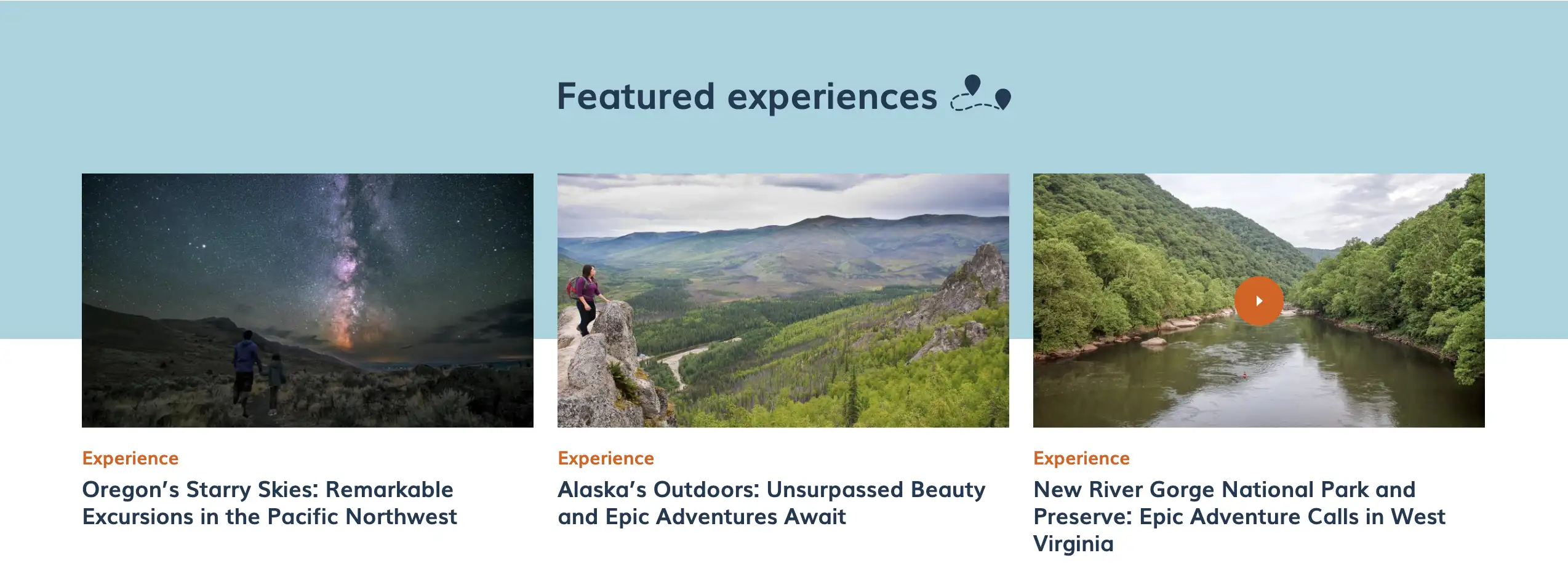
Most websites use patterns that they repeat across their sections or pages. The news listing example above is a pattern that can be used for not only displying news articles, but maybe also events, social media posts, and more. This is great because identifying these patterns can help us create better image styles and responsive image styles that are reusable. This is what I meant in the previous post when I said that if you are fortunate enough to have designs for your project, you will be able to identify these patterns right away. Let's keep this in mind as we get back into exercise mode.
Resolution switching
Here's where all of our knowledge about <picture> (art direction) and srcset and sizes (resolution switching) comes in handy. We'll start with resolution switching because art direction requires additional tooling and configuration.
In Drupal 8 we used the Picture and Breakpoints contrib modules to handle responsive images. Starting with Drupal 9, Drupal provides the "Responsive image" core module which means we don't need to install any contrib modules. Responsive image is not enabled by default.
- Enable the Responsive image core module (/admin/modules)
- Once enabled, head over to
/admin/config/media/responsive-image-styleto begin creating our first responsive image style - Click Add responsive image style
- Type Content grid as the label for the responsive image style
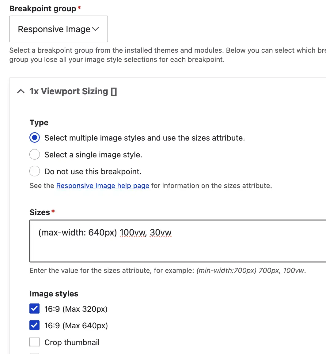
- Select *Responsive image from the Breakpoint group dropdown
- Scroll down and select a Fallback image style (16:9 (Max 320px))
- Expand the 1x Viewport Sizing [] fieldset
- Under Type, chose Select multiple image styles and use the sizes attribute
- Under Sizes type the following: (max-width:640px) 100vw, 30vw (I'll explain shortly)
- Under Image styles select the image styles we created before
- Scroll down and click Save
Let's go over everything we just did
Since we are doing resolution switching and not art direction, we chose Responsive image from the Breakpoint group dropdown. Doing so presents to us the 1x Vieport Sizing [] screen with the following options:
- Type: Again, since we are doing resolution switching, the obvious choice here is Select multiple image styles and use the sizes attribute. The other two options are irrelevant in this particular example.
- Sizes: The Sizes option is where we tell the browser how big/small our images should be rendered in relation to the viewport being used. Depending on our goal, this field accepts a single value or a media query with some conditions. Let's say we wanted our images to always render at full width regardless of the device being used (like a Hero image for example), then the value for the Sizes field would be 100vw (100% the viewport width). In our case however, we want the image to display full width, but only if the viewport/device is not larger than 640px, otherwise, meaning if the viewport/device is larger than 640px, we want the image to display at 30% the viewport width. We could had also used a pixel-based value such as 400px for example.
- Image styles: This is where we choose the image styles we want to make available for the browser to pick from. Think of this as the
srcsetattribute in the<img>tag. - Fallback image: We pick a fallback image in case all the above fails.
Very important: Remember in the Responsive images using srcset and sizes attributes post our claim was that it's better to let the browser pick the best image possible as the browser is smarter than us? This is exactly what we are doing here. We are providing the browser with a collection of images to pick from. Each image provides its dimensions. Then we tell the browser how big/small we want the images to be rendered. One thing we are not doing is telling the browser which image to use, we let the browser make that decision. This is the complete opposite of what we do when we use <picture>. As a reminder, the method used above is what you would do in most of your images. This is like the default configuration for your responsive images. Only when you need to crop your images differently for each device size is when you would use the art direction approach.
Navigate posts within this series