Responsive images, wrapping up
As far as image resolution switching, all the work we need to do is done. We will proceed to creating a quick Drupal view to display a list of news articles each of which will have a responsive image. When we finish with that, we will do the last pending thing, configuring responsive image styles using the <picture> element. You didn't forget about the picture element, did you?
Creating a new Drupal view for news articles
Out of the box Drupal already comes with a view that shows a list of content, but in the Olivero theme this view is not displayed the way we need it, so we will create our own view.
- From the admin toolbar, click, Structure | Views
- Click Add view
- Give the new view any name you wish (i.e. News, Latest News, etc.)
- In the View settings select to show Content of type Article
- In Page settings check Create a page
- Page title can be anything you wish
- Type news (lower case) as the path
- Under Page display settings chose Unformatted list of teasers
- Scroll and click Save and edit
- Scroll down and click Save
Two important things in the view above:
- The path is the url where the content list will be available (i.e. https://my-site.com/news).
- Using Teaser allows us to make sure of all the previous configuration we've done for responsive images.
With the view now in place, go to the new page we created, /news. This should show a list of news articles. Don't worry if the list does not look like the screenshot we showed earlier. The main thing is that you get a list of articles with images. The images in each article should reflect the configuration we setup for responsive images. You can check this by inspecting the images and you should see many of the attributes we configured. See example below.
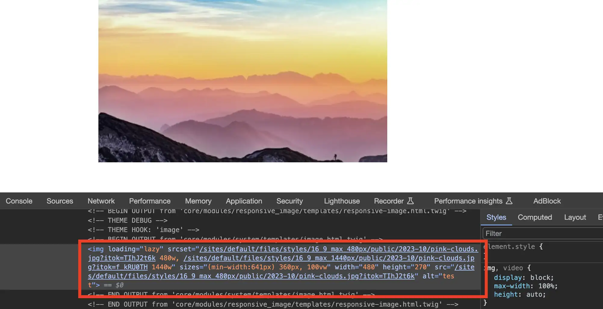
- First, the image is rendering using the
imgtag and not<picture> - The img tag uses the
srcsetandsizesattributes - We can see the diferent image styles we created
That's it! We have completed all the steps for managing responsive images using the resolution switching approach. Now we will complete this series by going back to creating a new responsive image style but this time using the <picture> element.
Responsive image style using art direction
I opted to leave this approach for last because it requires a couple of extra tools that are not part of Drupal core. As previously mentioned, art direction requires that each device gets an image cropped differently to ensure better user experience. Although Drupal provides a cropping "effect" within image styles, it is an automatic cropping process and cannot be customized for each image. This may not always work because we don't know what the focal point for each image we need cropped may need to be when trying to achieve art direction. For example, I may upload an image that I need to crop so the focal point is on the top-left corner, but next time I may upload an image where the focal point should be the bottom-right corner. Focal point refers to picking the area that is the most important to display specially on small devices.
What we need is to be able to manually crop each image we intend to do art direction with as we add them to the site. The good news is that within the Drupal echosystem we have many tools to choose from. In the interest of time, I'm going to simply discuss the tools you need to be able to manually crop your images on demand, but will not go into detail about their configuration or settings as those modules/tools have good documentation you can follow for proper configuration.
Here are the tools we will be working with:
- Crop API: On its own it does nothing, but in combination with other tools like Image widget crop, it gives you the ability to crop images on demand.
- Image widget crop: Provides the UI for content creators to be able to crop images on demand. It has a hard requirement of the Crop API module.
- Cropper: A simple jQuery image cropping plugin for added cropping functionality.
Note: With the exception of the Crop API module, the other two tools above are optional or can be replaced by other similar tools/modules. Often times the modules you pick for a job depend on your unique requirements. So don't feel you need to use the tools above if you know of other equivalent ones that may do a better job.
Next key steps to complete
With your tools inplace, you will probably need to complete the following steps:
- Creating crop types
- Create image styles that match your images rendering requirements (aspect ratio, dimentions, crop settings, etc)
- Adding a new effect to image styles that use "Manual crop"
- Create new responsive image style using the
<picture>element
Crop types: They are in principle similar to image styles. They allow us to setup parameters for how to crop images. In particular, they help us predefine aspect ratios for cropping images. We can create a Square crop type, 3:2 crop type, 16:9 crop type, etc. Important to note, crop types's main job is to define cropping parameters in images, they don't restrict you from manually picking the image focal point.
Image styles: Since we are going to be doing art direction, we will need image styles that allow for custom/manual cropping. We already know how to create image styles, the ones for art direction will follow the behavior of the hero image on this page. Notice how the main images are wide when viewed in a large screen, but if you resize your browser or view the site on a mobile device the images become narrow and their aspect ratio changes. See both examples below.
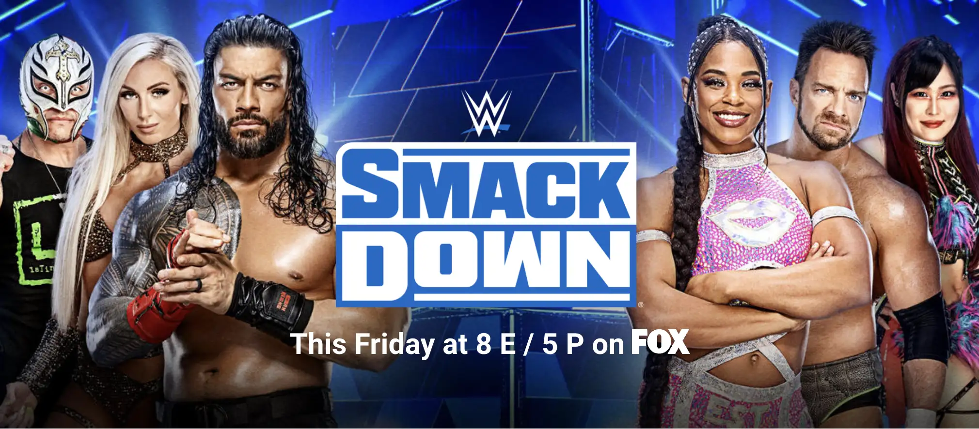
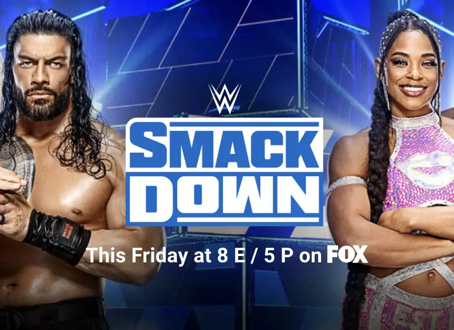
The examples above shows an image cropped differently for different device sizes. This is Art Direction and is achieved using the <picture> element.
Responsive image styles using <picture>
The biggest difference between creating responsive image styles for resolution switching and art direction is the "Breakpoint group" we select. Let's go through the process now:
- If you haven't already, enabled the Responsive image module
- Head over to
/admin/config/media/responsive-image-styleto begin creating a responsive image style - Click Add responsive image style
- Type Banner as the label for the responsive image style. This name is solely based on the image examples above. Feel free to assign any name that makes sense to you.
- Select Olivero from the Breakpoint group dropdown. If you are using a different theme, choose that theme from the dropdown. We will discuss breakpoints in a bit.
- Scroll down and select a Fallback image style. Pick an image style that could be used on desktop and mobile if all failed with our responsive image style.
Breakpoints
Breakpoints are defined in your theme's <theme-name>.breakpoints.yml which is located in the root of your theme. For each device you wish to target you create a breakpoint. Here's an example (I modified the breakpoints slightly for better read):
olivero.sm:
  label: Small
  mediaQuery: 'all and (min-width: 500px)'
  weight: 0
  multipliers:
    - 1x
    - 2x
olivero.md:
  label: Medium
  mediaQuery: 'all and (min-width: 960px)'
  weight: 1
  multipliers:
    - 1x
olivero.lg:
  label: Large
  mediaQuery: 'all and (min-width: 1440px)'
  weight: 2
  multipliers:
    - 1x
Based on the breakpoints found in *.breakpoints.yml, you should see an image similar to the one below which should reflect the same breakpoints.
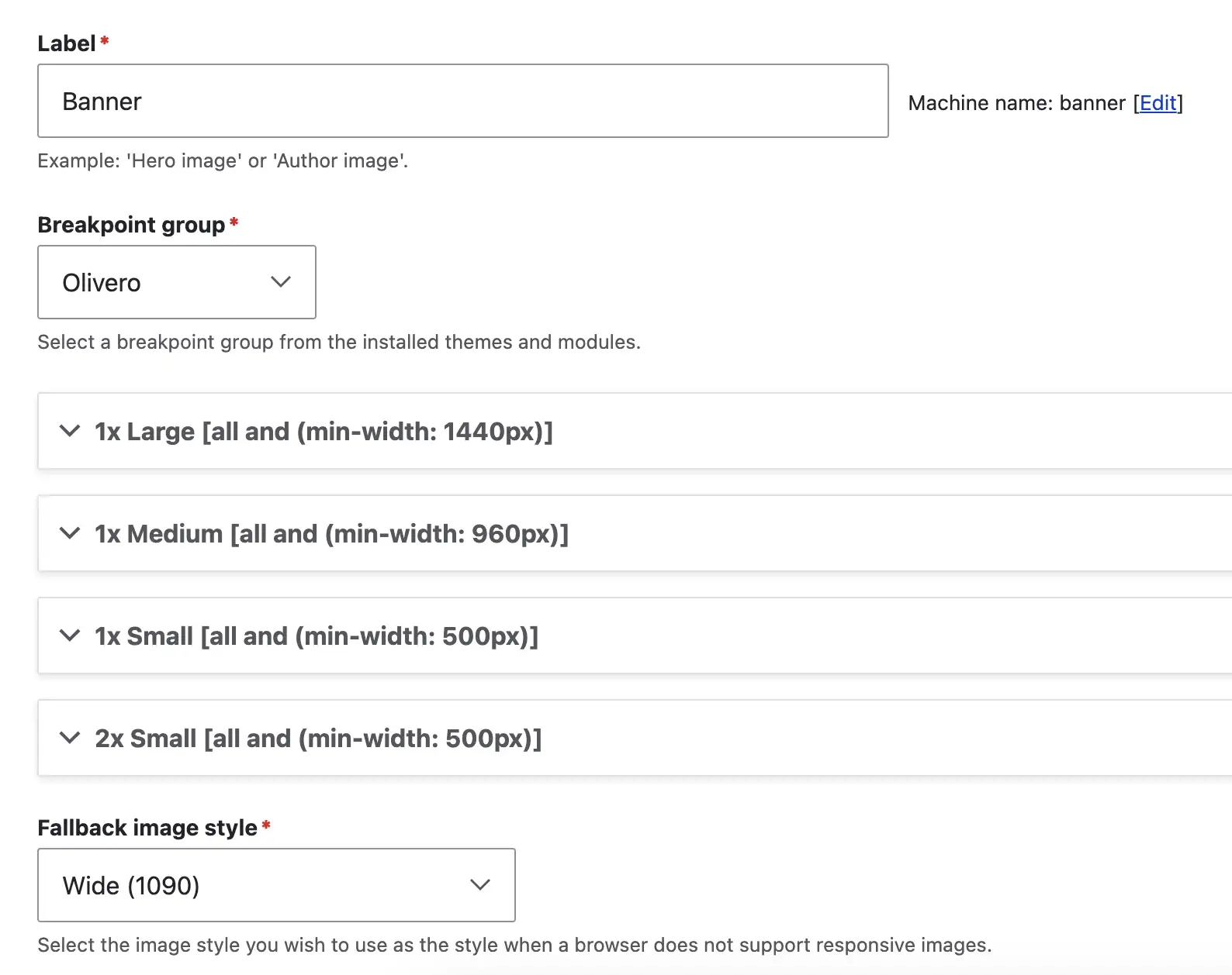
- Expand any of the breakpoints fieldset and you should see a familiar set of settings. Think of each fieldset you expand here as the
<source>element inside the<picture>element. This is where we choose a list of image styles. Then we repeat the process for each breakpoint. This is where we are telling the browser which images to use for each device size and therefore setting up art direction. - The sizes field works the same as what we did in resolution switching.
- Once you have completed all yoru configuration, save your changes.
What's next
Once the responsive image style above is ready to go, You can repeat the process of creating a new view mode for your Media image and configuring it to use the new responsive image style you created above (Banner).
Navigate posts within this series