Automating your Drupal Front-end with ViteJS
ViteJS is the Next Generation Frontend Tooling, with a tremendous plugins ecosystem to enhance its functionality, and a great community behind it.

Modern web development relies heavily on automation to stay productive, validate code, and perform repetitive tasks that could slow developers down. Front-end development in particular has evolved, and it can be a daunting task to configure effective automation. In this post, I'll try to walk you through basic automation for your Drupal theme, which uses Storybook as its design system.
Recently I worked on a large Drupal project that needed to migrate its design system from Patternlab to Storybook. I knew switching design systems also meant switching front-end build tools. The obvious choice seemed to be Webpack, but as I looked deeper into build tools, I discovered ViteJS.
Vite is considered the Next Generation Frontend Tooling, and when tested, we were extremely impressed not only with how fast Vite is, but also with its plugin's ecosystem and its community support. Vite is relatively new, but it is solid and very well maintained. Learn more about Vite.
The topics covered in this post can be broken down in two categories:
Preparing the Front-end environment
Automating the environment
1. Build the front-end environment with Vite & Storybook
In a previous post, I wrote in detail how to build a front-end environment with Vite and Storybook, I am going to spare you those details here but you can reference them from the original post.
- In your command line, navigate to the directory where you wish to build your environment. If you're building a new Drupal theme, navigate to your site's
web/themes/custom/ - Run the following commands (Storybook should launch at the end):
npm create vite@latest storybook
cd storybook
npx storybook@latest init --type react
Fig. 1: The first command builds the Vite project, and the last one integrates Storybook into it.
Reviewing Vite's and Storybook's out of the box build scripts
Vite and Storybook ship with a handful of useful scripts. We may find some of them already do what we want or may only need minor tweaks to make them our own.
- In your code editor, open
package.jsonfrom the root of your newly built project. - Look in the scripts section and you should see something like this:
"scripts": {
  "dev": "vite",
  "build": "vite build",
  "lint": "eslint . --ext js,jsx --report-unused-disable-directives --max-warnings 0",
  "preview": "vite preview",
  "storybook": "storybook dev -p 6006",
  "build-storybook": "storybook build"
},
Fig. 2: Example of default Vite and Storybook scripts out of the box.
To run any of those scripts, prefix them with npm run. For example: npm run build, npm run lint, etc. Let's review the scripts.
- dev: This is a Vite-specific command which runs the Vite app we just build for local development
- build: This is the "do it all" command. Running
npm run buildon a project runs every task defined in the build configuration we will do later. CI/CD runners run this command to build your app for production. - lint: Will lint your JavaScript code inside
.jsor.jsxfiles. - preview: This is also another Vite-specific command which runs your app in preview mode.
- storybook: This is the command you run to launch and keep Storybook running while you code.
- build-storybook: To build a static version of Storybook to package it or share it, or to run it as a static version of your project.
Building your app for the first time
Getting a consistent environment
In front-end development, it is important everyone in your team use the same version of NodeJS while working in the same project. This ensures consistency in your project's behavior for everyone in your team. Differences in the node version your team uses can lead to inconsistencies when the project is built. One way to ensure your team is using the same node version when working in the same project, is by adding a .nvmrc file in the root of your project. This file specifies the node version your project uses. The node version is unique to each project, which means different projects can use different node versions.
- In the root of your theme, create a file called
.nvmrc(mind the dot) - Inside .nvmrc add the following:
v20.14.0 - Stop Storybook by pressing Ctrl + C in your keyboard
- Build the app:
nvm install
npm install
npm run build
Fig. 3: Installs the node version defined in .nvmrc, then installs node packages, and finally builds the app.
NOTE: You need to have NVM installed in your system to execute nvm commands. You only need to run nvm install once per project unless the node version changes. If you switch to a project that uses a different node version, when you return to this project, run nvm use to set your environment back to the right node version.
The output in the command line should look like this:
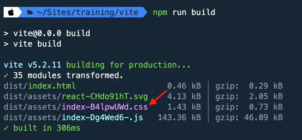
Fig. 4: Screenshot of files compiled by the build command.
By default, Vite names the compiled files by appending a random 8-character string to the original file name. This works fine for Vite apps, but for Drupal, the libraries we'll create expect for CSS and JS file names to stay consistent and not change. Let's change this default behavior.
- First, install the glob extension. We'll use this shortly to import multiple CSS files with a single import statement.
npm i -D glob- Then, open
vite.config.jsin your code editor. This is Vite's main configuration file. - Add these two imports around line 3 or directly after the last import in the file
import path from 'path';
import { glob } from 'glob';- Still in
vite.config.js, replace the export default... with the following snippet which adds new settings for file names:
export default defineConfig({
  plugins: [
  ],
  build: {
    emptyOutDir: true,
    outDir: 'dist',
    rollupOptions: {
      input: glob.sync(path.resolve(__dirname,'./src/**/*.{css,js}')),
      output: {
        assetFileNames: 'css/[name].css',
        entryFileNames: 'js/[name].js',
      },
    },
  },
})
Fig. 5: Build object to modify where files are compiled as well as their name preferences.
- First we imported
pathand{ glob }. path is part of Vite and glob was added by the extension we installed earlier. - Then we added a build configuration object in which we defined several settings:
- emptyOutDir: When the build job runs, the dist directory will be emptied before the new compiled code is added.
- outDir: Defines the App's output directory.
- rollupOptions: This is Vite's system for bundling code and within it we can include neat configurations:
- input: The directory where we want Vite to look for CSS and JS files. Here's where the path and glob imports we added earlier are being used. By using
src/**/**/*.{css,js}, we are instructing Vite to look three levels deep into the src directory and find any file that ends with .css or .js. - output: The destination for where CSS and JS will be compiled into (dist/css and dist/js), respectively. And by setting
assetFileNames: 'css/[name].css', andentryFileNames: 'css/[name].js', CSS and JS files will retain their original names.
- input: The directory where we want Vite to look for CSS and JS files. Here's where the path and glob imports we added earlier are being used. By using
Now if we run npm run build again, the output should be like this:
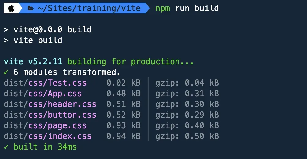
Fig. 6: Screenshot of compiled code using the original file names.
The random 8-character string is gone and notice that this time the build command is pulling more CSS files. Since we configured the input to go three levels deep, the src/stories directory was included as part of the input path.
2. Restructure the project
The out of the box Vite project structure is a good start for us. However, we need to make some adjustments so we can adopt the Atomic Design methodology. This is today's standards and will work well with our Component-driven Development workflow. At a high level, this is the current project structure:
> .storybook/
> dist/
> public/
> src/
  |- stories/
package.json
vite.config.js
Fig. 7: Basic structure of a Vite project listing only the most important parts.
- > .storybook is the main location for Storybook's configuration.
- > dist is where all compiled code is copied into and where the production app looks for all code.
- > public is where we can store images and other static assets we need to reference from our site. Equivalent to Drupal's
/sites/default/files/. - > src is the directory we work out of. We will update the structure of this directory next.
- package.json tracks all the different node packages we install for our app as well as the scripts we can run in our app.
- vite.config.js is Vite's main configuration file. This is probably where we will spend most of our time.
Adopting the Atomic Design methodology
The Atomic Design methodology was first introduced by Brad Frost a little over ten years ago. Since then it has become the standard for building web projects. Our environment needs updating to reflect the structure expected by this methodology.
- First stop Storybook from running by pressing Ctrl + C in your keyboard.
- Next, inside src, create these directories: base, components, and utilities.
- Inside components, create these directories: 01-atoms, 02-molecules, 03-organisms, 04-layouts, and 05-pages.
- While we're at it, delete the stories directory inside src, since we won't be using it.
NOTE: You don't need to use the same nomenclature as what Atomic Design suggests. I am using it here for simplicity.
Update Storybook's stories with new paths
Since the project structure has changed, we need to make Storybook aware of these changes:
- Open .storybook/main.js in your code editor
- Update the stories: [] array as follows:
stories: [
  "../src/components/**/*.mdx",
  "../src/components/**/*.stories.@(js|jsx|mjs|ts|tsx)",
],
Fig. 8: Updating stories' path after project restructure.
The Stories array above is where we tell Storybook where to find our stories and stories docs, if any. In Storybook, stories are the components and their variations.
Add pre-built components
As our environment grows, we will add components inside the new directories, but for the purpose of testing our environment's automation, I have created demo components.
- Download demo components (button, title, card), from src/components/, and save them all in their content part directories in your project.
- Feel free to add any other components you may have built yourself. We'll come back to the components shortly.
3. Configure TwigJS
Before we can see the newly added components, we need to configure Storybook to understands the Twig and YML code we are about to introduce within the demo components. To do this we need to install several node packages.
- In your command line run:
npm i -D vite-plugin-twig-drupal @modyfi/vite-plugin-yaml twig twig-drupal-filters html-react-parser- Next, update
vite.config.jswith the following configuration. Add the snippet below at around line 5:
import twig from 'vite-plugin-twig-drupal';
import yml from '@modyfi/vite-plugin-yaml';
import { join } from 'node:path';
Fig. 9: TwigJS related packages and Drupal filters function.
The configuration above is critical for Storybook to understand the code in our components:
vite-plugin-twig-drupal, is the main TwigJS extension for our project.- Added two new
imports which are used by Storybook to understand Twig:vite-plugin-twig-drupalhandles transforming Twig files into JavaScript functions.@modyfi/vite-plugin-yamllet's us pass data and variables through YML to our Twig components.
Creating Twig namespaces
- Still in
vite.config.js, add the twig and yml() plugins to add Twig namespaces for Storybook.
  plugins: [
    twig({
      namespaces: {
        atoms: join(__dirname, './src/components/01-atoms'),
        molecules: join(__dirname, './src/components/02-molecules'),
        organisms: join(__dirname, './src/components/03-organisms'),
        layouts: join(__dirname, './src/components/04-layouts'),
        pages: join(__dirname, './src/components/05-pages'),
      },
    }),
    yml(),
  ],
Fig. 10: Twig namespaces reflecting project restructure.
Since we removed the react() function by using the snippet above, we can remove import react from '@vitejs/plugin-react' from the imports list as is no longer needed.
With all the configuration updates we just made, we need to rebuild the project for all the changes to take effect. Run the following commands:
npm run build
npm run storybook
The components are available but as you can see, they are not styled even though each component contains a CSS stylesheet in its directory. The reason is Storybook has not been configured to find the component's CSS. We'll address this shortly.
4. Configure postCSS
What is PostCSS? It is a JavaScript tool or transpiler that turns a special PostCSS plugin syntax into Vanilla CSS.
As we start interacting with CSS, we need to install several node packages to enable functionality we would not have otherwise. Native CSS has come a long way to the point that I no longer use Sass as a CSS preprocessor.
- Stop Storybook by pressing Ctrl + C in your keyboard
- In your command line run this command:
npm i -D postcss postcss-import postcss-import-ext-glob postcss-nested postcss-preset-env- At the root of your theme, create a new file called postcss.config.js, and in it, add the following:
import postcssImport from 'postcss-import';
import postcssImportExtGlob from 'postcss-import-ext-glob';
import postcssNested from 'postcss-nested';
import postcssPresetEnv from 'postcss-preset-env';

export default {
  plugins: [
    postcssImportExtGlob(),
    postcssImport(),
    postcssNested(),
    postcssPresetEnv({
      stage: 4,
    }),
  ],
};
Fig. 11: Base configuration for postCSS.
One cool thing about Vite is that it comes with postCSS functionality built in. The only requirement is that you have a postcss.config.js file in the project's root. Notice how we are not doing much configuration for those plugins except for defining them. Let's review the code above:
postcss-importthe base for importing CSS stylesheets.postcss-import-ext-globto do bulk@importof all CSS content in a directory.postcss-nestedto unwrap nested rules to make its syntax closer to Sass.postcss-preset-envdefines the CSS browser support level we need. Stage 4 means we want the "web standards" level of support.
5. CSS and JavaScript configuration
The goal here is to ensure that every time a new CSS stylesheet or JS file is added to the project, Storybook will automatically be aware and begin consuming their code.
NOTE: This workflow is only for Storybook. In Drupal we will use Drupal libraries in which we will include any CSS and JS required for each component.
There are two types of styles to be configured in most project, global styles which apply site-wide, and components styles which are unique to each component added to the project.
Global styles
- Inside src/base, add two stylesheets:
reset.cssandbase.css. - Copy and paste the styles for reset.css and base.css.
- Inside src/utilities create
utilities.cssand in it paste these styles. - Inside src/, create a new stylesheet called
styles.css. - Inside styles.css, add the following imports:
@import './base/reset.css';
@import './base/base.css';
@import './utilities/utilities.css';
Fig. 12: Imports to gather all global styles.
The order in which we have imported our stylesheets is important as the cascading order in which they load makes a difference. We start from reset to base, to utilities.
reset.css: A reset stylesheet (or CSS reset) is a collection of CSS rules used to clear the browser's default formatting of HTML elements, removing potential inconsistencies between different browsers before any of our styles are applied.base.css: CSS Base applies a style foundation for HTML elements that is consistent for baseline styles such as typography, branding and colors, font-sizes, etc.utilities.css: Are a collection of pre-defined CSS rules we can apply to any HTML element. Rules such as variables for colors, font size, font color, as well as margin, sizes, z-index, animations, etc.
Component styles
Before our components can be styled with their unique and individual styles, we need to make sure all our global styles are loaded so the components can inherit all the base/global styles.
- Inside src/components create a new stylesheet,
components.css. This is where we are going to gather all components styles. - Inside
components.cssadd glob imports for each of the component's categories:
@import-glob './01-atoms/**/*.css';
@import-glob './02-molecules/**/*.css';
Fig. 13: Glob import for all components of all categories.
NOTE: Since we only have Atoms and Molecules to work with, we are omitting imports for 03-organisms, 04-layouts, 05-pages. Feel free to add them if you have that kind of components.
Updating Storybook's Preview
There are several ways in which we can make Storybook aware of our styles and javascript. We could import each component's stylesheet and javascript into each *.stories.js file, but this could result in some components with multiple sub-components having several CSS and JS imports. In addition, this is not an automated system which means we need to manually do imports as they become available. The approach we are going to take is importing the stylesheets we created above into Storybook's preview system. This provides a couple of advantages:
- The component's *.stories.js files are clean without any css imports as all CSS will already be available to Storybook.
- As we add new components with individual stylesheets, these stylesheets will automatically be recognized by Storybook.
Remember, the order in which we import the styles makes a difference. We want all global and base styles to be imported first, before we import component styles.
- In
.storybook/preview.jsadd these imports at the top of the page around line 2.
import Twig from 'twig';
import drupalFilters from 'twig-drupal-filters';
import '../src/styles.css'; /* Contains reset, base, and utilities styles. */
import '../src/components/components.css'; /* Contains all components CSS. */

function setupFilters(twig) {
  twig.cache();
  drupalFilters(twig);
  return twig;
}

setupFilters(Twig);
Fig. 14: Importing all styles, global and components.
In addition to importing two new extensions: twig and twig-drupal-filters, we setup a setupFilters function for Storybook to read Drupal filters we may use in our components. We are also importing two of the stylesheets we created earlier:
styles.csscontains all the CSS code from reset.css, base.css, and utilities.css (in that order)components.csscontains all the CSS from all components. As new components are added and they have their own stylesheets, they will automatically be included in this import.
JavaScript compiling
On a typical project, you will find that the majority of your components don't use JavaScript, and for this reason, we don't need such an elaborate system for JS code. Importing the JS files in the component's *.stories.js should work just fine. Since the demo components dont use JS, I have commented near the top of card.stories.js how the component's JS file would be imported if JS was needed.
If the need for a more automated JavaScript processing workflow arose, we could easily repeat the same CSS workflow but for JS.
Build the project again
Now that our system for CSS and JS is in place, let's build the project to ensure everything is working as we expect it.
npm run build
npm run storybook
You may notice that now the components in Storybook look styled. This tells us our new system is working as expected. However, the Card component, if you used the demo components, is missing an image. We will address this issue in the next section.
This concludes the preparation part of this post. The remaining part will focus on creating automation tasks for compiling, minifying and linting code, copying static assets such as images, and finally, watching for code changes as we code.6. Copying images and other assets
Copying static assets like images, icons, JS, and other files from src into dist is a common practice in front-end projects. Vite comes with built-in functionality to do this. Your assets need to be placed in the public directory and Vite will automatically copy them on build. However, sometimes we may have those assets alongside our components or other directories within our project.
In Vite, there are many ways to accomplish any task, in this case, we will be using a nice plugin called vite-plugin-static-copy. Let's set it up.
- If Storybook is running, kill it with Ctrl + C in your keyboard
- Next, install the extension by running:
npm i -D vite-plugin-static-copy- Next, right after all the existing imports in
vite.config.js, import one more extension:
import { viteStaticCopy } from 'vite-plugin-static-copy';- Lastly, still in
vite.config.js, add theviteStaticCopyfunction configuration inside theplugins:[]array:
viteStaticCopy({
  targets: [
  {
    src: './src/components/**/*.{png,jpg,jpeg,svg,webp,mp4}',
    dest: 'images',
  }],
}),
Fig. 15: Adds tasks for copying JavaScript and Images from src to dist.
The viteStaticCopy function we added allows us to copy any type of static assets anywhere within your project. We added a target array in which we included src and dest for the images we want copied. Every time we run npm run build, any images inside any of the components, will be copied into dist/images.
If you need to copy other static assets, simply create new targets for each.
- Build the project again:
npm run build
npm run storybook
The missing image for the Card component should now be visible, see below. Pretty sweet! 🍰

Fig. 16: Screenshot of the Card component in Storybook.
7. The Watch task
A watch task makes it possible for developers to see the changes they are making as they code, and without being interrupted by running commands. Depending on your configuration, a watch task watches for any changes you make to CSS, JavaScript and other file types, and upon saving those changes, code is automatically compiled, and a Hard Module Reload (HMR) is evoked, making the changes visible in Storybook.
Although there are extensions to create watch tasks, we will stick with Storybook's out of the box watch functionality because it does everything we need. In fact, I have used this very approach on a project that supports over one hundred sites.
I actually learned this the hard way, I originally was importing the key stylesheets in .storybook/preview.js using the files from dist. This works to an extend because the code is compiled upon changes, but Storybook is not aware of the changes unless we restart Storybook. I spent hours debugging this issue and tried so many other options, but at the end, the simple solution was to import CSS and JS into Storybook's preview using the source files. For example, if you look in .storybook/preview.js, you will see we are importing two CSS files which contain all of the CSS code our project needs:
import '../src/styles.css';
import '../src/components/components.css';
Fig. 17: Importing source assets into Storybook's preview.
Importing source CSS or JS files into Storybook's preview allows Storybook to become aware immediately of any code changes.
The same, or kind of the same works for JavaScript. However, the difference is that for JS, we import the JS file in the component's *.stories.js, which in turn has the same effect as what we've done above for CSS. The reason for this is that typically not every component we build needs JS.
A real watch task
Currently we are running npm run storybook as a watch task. Nothing wrong with this. However, to keep up with standards and best practices, we could rename the storybook command, watch, so we can run npm run watch. Something to consider.
You could also make a copy of the storybook command and name it watch and add additional commands you wish to run with watch, while leaving the original storybook command intact. Choices, choices.
8. Linting CSS and JavaScript
Our workflow is coming along nicely. There are many other things we can do but for now, we will end with one last task: CSS and JS linting.
- Install the required packages. There are several of them.
npm i -D eslint stylelint vite-plugin-checker stylelint-config-standard stylelint-order stylelint-selector-pseudo-class-lvhfa- Next, after the last import in
vite.config.js, add one more:
import checker from 'vite-plugin-checker';- Then, let's add one more plugin in the
plugins:[]array:
checker({
  eslint: {
    lintCommand: 'eslint "./src/components/**/*.{js,jsx}"',
  },
  stylelint: {
    lintCommand: 'stylelint "./src/components/**/*.css"',
  },
}),
Fig. 18: Checks for linting CSS and JavaScript.
So we can execute the above checks on demand, we can add them as commands to our app.
- In package.json, within the scripts section, add the following commands:
"eslint": "eslint . --ext js,jsx --report-unused-disable-directives --max-warnings 0",
"stylelint": "stylelint './src/components/**/*.css'",
Fig. 19: Two new npm commands to lint CSS and JavaScript.
- We installed a series of packages related to ESLint and Stylelint.
vite-plugin-checkeris a plugin that can run TypeScript, VLS, vue-tsc, ESLint, and Stylelint in worker thread.- We imported
vite-plugin-checkerand created a new plugin with two checks, one for ESLint and the other for Stylelint. - By default, the new checks will run when we execute
npm run build, but we also added them as individual commands so we can run them on demand.
Configure rules for ESLint and Stylelint
Both ESLint and Stylelint use configuration files where we can configure the various rules we want to enforce when writing code. The files they use are eslint.config.js and .stylelintrc.yml respectively. For the purpose of this post, we are only going to add the .stylelintrc.yml in which we have defined basic CSS linting rules.
- In the root of your theme, create a new file called .stylelintrc.yml (mind the dot)
- Inside .stylelintrc.yml, add the following code:
extends:
  - stylelint-config-standard
plugins:
  - stylelint-order
  - stylelint-selector-pseudo-class-lvhfa
ignoreFiles:
  - './dist/**'
rules:
  at-rule-no-unknown: null
  alpha-value-notation: number
  color-function-notation: null
  declaration-empty-line-before: never
  declaration-block-no-redundant-longhand-properties: null
  hue-degree-notation: number
  import-notation: string
  no-descending-specificity: null
  no-duplicate-selectors: true
  order/order:
    - - type: at-rule
        hasBlock: false
      - custom-properties
      - declarations
    - unspecified: ignore
      disableFix: true
  order/properties-alphabetical-order: error
  plugin/selector-pseudo-class-lvhfa: true
  property-no-vendor-prefix: null
  selector-class-pattern: null
  value-keyword-case:
    - lower
    - camelCaseSvgKeywords: true
      ignoreProperties:
        - /^--font/
Fig. 20: Basic CSS Stylelint rules.
The CSS rules above are only a starting point, but should be able to check for the most common CSS errors.
Test the rules we've defined by running either npm run build or npm run stylelint. Either command will alert you of a couple of errors our current code contains. This tells us the linting process is working as expected. You could test JS linting by creating a dummy JS file inside a component and writing bad JS in it.
9. One last thing
It goes without saying that we need to add storybook.info.yml and storybook.libraries.yml files for this to be a true Drupal theme. In addition, we need to create the templates directory somewhere within our theme.
storybook.info.yml
The same way we did for Storybook, we need to create namespaces for Drupal. This requires the Components module and storybook.info.yml configuration is like this:
components:
 namespaces:
    atoms:
      - src/components/01-atoms
    molecules:
      - src/components/02-molecules
    organisms:
      - src/components/03-organisms
    layouts:
      - src/components/04-layouts
    pages:
      - src/components/05-pages
    templates:
      - src/templates
Fig. 21: Drupal namespaces for nesting components.
storybook.libraries.yml
The recommended method for adding CSS and JS to components or a theme in Drupal is by using Drupal libraries. In our project we would create a library for each component in which we will include any CSS or JS the component needs. In addition, we need to create a global library which includes all the global and utilities styles. Here are examples of libraries we can add in storybook.libraries.yml.
global:
  version: VERSION
  css:
    base:
      dist/css/reset.css: {}
      dist/css/base.css: {}
      dist/css/utilities.css: {}

button:
  css:
    component:
      dist/css/button.css: {}

card:
  css:
    component:
      dist/css/card.css: {}

title:
  css:
    component:
      dist/css/title.css: {}
Fig. 22: Drupal libraries for global styles and component's styles.
/templates
Drupal's templates' directory can be created anywhere within the theme. I typically like to create it inside the src directory. Go ahead and create it now.
- Inside storybook.info.yml, add a new Twig namespace for the templates directory. See example above. Update your path accordingly based on where you created your templates directory.
P.S: When the Vite project was originally created at the begining of the post, Vite created files such as App.css, App.js, main.js, and index.html. All these files are in the root of the project and can be deleted. It won't affect any of the work we've done, but Vite will no longer run on its own, which we don't need it to anyway.
In closing
I realize this is a very long post, but there is really no way around it when covering these many topics in a single post. I hope you found the content useful and can apply it to your next Drupal project. There are different ways to do what I've covered in this post, and I challenge you to find better and more efficient ways. For now, thanks for visiting.
Download the theme
A full version of the Drupal theme built with this post can be downloaded.
Make sure you are using the theme branch from the repo.


I welcome your feedback about this post.