Integrating Drupal with Storybook components

Hey you're back! 🙂 In the previous post we talked about how to build a custom Drupal theme using Storybook as the design system. We also built a simple component to demonstrate how Storybook, using custom extensions, can understand Twig. In this post, the focus will be on making Drupal aware of those components by connecting Drupal to Storybook.
If you are following along, we will continue where we left off to take advantage of all the prep work we did in the previous post. Topics we will cover in this post include:
- What is Drupal integration
- Installing and preparing Drupal for integration
- Building components in Storybook
- Building a basic front-end workflow
- Integrating Drupal with Storybook components
What is Drupal integration?
In the context of Drupal development using the component-driven methodology, Drupal integration means connecting Drupal presenter templates such as node.html.twig, block.html.twig, paragraph.html.twig, etc. to Storybook by mapping Drupal fields to component fields in Storybook. This in turn allows for your Drupal content to be rendered wrapped in the Storybook components.
The advantage of using a design system like Storybook is that you are in full control of the markup when building components, as a result your website is more semantic, accessible, and easier to maintain.
Building more components in Storybook
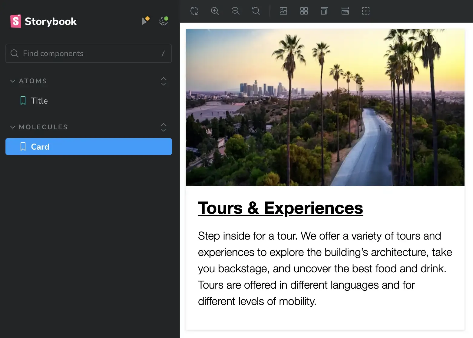
The title component we built in the previous post may not be enough to demonstrate some of the advanced techniques when integrating components. We will build a larger component to put these techniques in practice. The component we will build is called Card and it looks like this:

When building components, I like to take inventory of the different parts that make up the components I'm building. The card image above shows three parts: An image, a title, and teaser text. Each of these parts translates into fields when I am defining the data structure for the component or building the entity in Drupal.
Building the Card component
- Open the Drupal site in your code editor and within your code editor navigate to the storybook theme (
web/themes/custom/storybook) - Create two new directories inside components called 01-atoms and 02-molecules
- Inside 02-molecules create a new directory called card
- Inside the card directory add the following four files:
- card.css: component's styles
- card.twig: component's markup and logic
- card.stories.jsx: Storybook's story
- card.yml: component's demo data
- Add the following code snippet to card.yml:
---
modifier: ''
image: <img src="https://source.unsplash.com/cHRDevKFDBw/640x360" alt="Palm trees near city buildings" />
title:
  level: 2
  modifier: ''
  text: 'Tours & Experiences'
  url: 'https://mariohernandez.io'
teaser: 'Step inside for a tour. We offer a variety of tours and experiences to explore the building’s architecture, take you backstage, and uncover the best food and drink. Tours are offered in different languages and for different levels of mobility.'- Add the following to card.twig to provide the markup and logic for the card:
{{ attach_library('storybook/card') }}

<article class="card{{ modifier ? ' ' ~ modifier }}{{- attributes ? ' ' ~ attributes.class -}}" {{- attributes ? attributes|without(class) -}}>
  {% if image %}
    <div class="card__image">
      <figure>
        {{ image }}
      </figure>
    </div>
  {% endif %}

  <div class="card__content">
    {% if title %}
      {% include "@atoms/title/title.twig" with {
        'level': title.level,
        'modifier': title.modifier,
        'text': title.text,
        'url': title.url,
      } only %}
    {% endif %}

    {% if teaser %}
      <p class="card__teaser">{{ teaser }}</p>
    {% endif %}
  </div>
</article>
Code snippet for building card
Copy and paste these styles into card.css.
Finally, let's create the Storybook card story by adding the following to card.stories.jsx:
import parse from 'html-react-parser';

import card from './card.twig';
import data from './card.yml';
import './card.css';

const component = {
  title: 'Molecules/Card',
};

export const Card = {
  render: (args) => parse(card(args)),
  args: { ...data },
};

export default component;
Let's go over a few things regarding the code above:
- The data structure in card.yml reflects the data structure and type we will use in Drupal.
- The image field uses the entire
<img>element rather than just using the image src and alt attributes. The reason for this is so when we get to Drupal, we can use Drupal's full image entity. This is a good practice for caching purposes.
- The image field uses the entire
- card.twig reuses the title component we created in the previous post. Rather than build a title from scratch for the Card and repeat the code we already wrote, reusing the existing components keeps us DRY.
- card.stories.jsx in the Storybook story for the Card, notice how the code in this file is very similar to the code in the title.stories.jsx. Even with complex components, when we port them into Storybook as stories, most times the code will be similar as what you see above because Storybook is simply parsing whatever is in .twig and .yml files. There are exceptions when the React code may have extra parameters or logic which typically happens when we're building stories variations. Maybe a topic for a different blog post. 😉
Before we preview the Card, some updates are needed
You may have noticed in card.twig we used the namespace @atoms when nesting the title component. This namespace does not exist, and we need to create it now. In addition, we need to move the title component into the 01-atoms directory:
- In your code editor or command line (whichever is easier), move the title directory into the 01-atoms directory
- In your editor, open title.stories.jsx and change the line
title: 'Components/Title' to title: 'Atoms/Title'. This will display the title component within the Atoms category in Storybook's sidebar. - Rather than have you make individual changes to vite.config.js, let's replace/overwrite all its content with the following:
/* eslint-disable */
import { defineConfig } from 'vite'
import yml from '@modyfi/vite-plugin-yaml';
import twig from 'vite-plugin-twig-drupal';
import { join } from 'node:path'
export default defineConfig({
  root: 'src',
  publicDir: 'public',
  build: {
    emptyOutDir: true,
    outDir: '../dist',
    rollupOptions: {
      input: {
        'reset': './src/css/reset.css',
        'styles': './src/css/styles.css',
        'card': './src/components/02-molecules/card/card.css',
      },
      output: {
        assetFileNames: 'css/[name].css',
      },
    },
    sourcemap: true,
  },
  plugins: [
    twig({
      namespaces: {
        atoms: join(__dirname, './src/components/01-atoms'),
        molecules: join(__dirname, './src/components/02-molecules'),
      },
    }),
    // Allows Storybook to read data from YAML files.
    yml(),
  ],
})
Let's go over some of the most noticeable updates inside vite.config.js:
We have defined a few things to improve the functionality of our Vite project, starting with using src as our app root directory and public for publicDir. This helps the app understand the project structure in a relative manner.
Next, we defined a Build task which provides the app with defaults for things like where should it compiled code to (i.e. /dist), and
rollupOptionsfor instructing the app which stylesheets to compile and what to call them.As part of the
rollupOptionswe also defined two stylesheets for global styles (reset.css and styles.css). We'll create these next.Important: This is as basic as it gets for a build workflow and in no way would I recommend this be your front-end build workflow. When working on bigger projects with more components, it is best to define a more robust and dynamic workflow that provides automation for all the repetitive tasks performed on a typical front-end project.
Under the Plugins section, we have defined two new namespaces, @atoms and @molecules, each of which points to specific path within our components directory. These are the namespaces Storybook understands when nesting components. You can have as many namespaces as needed.
Adding global styles
- Inside storybook/src, create a new directory called css
- Inside the css directory, add two new files, reset.css and styles.css
- Here are the styles for reset.css and styles.css. Please copy them and paste them into each of the stylesheets.
- Now for Storybook to use reset.css and styles.css, we need to update /.storybook/preview.js by adding these two imports directly after the current imports, around line 4.
import '../dist/css/reset.css';
import '../dist/css/styles.css';
Previewing the Card in Storybook
Remember, you need NodeJS v20 or higher as well as NVM installed on your machine.
- In your command line, navigate to the storybook directory and run:
nvm install
npm install
npm run build
npm run storybook
A quick note about the commands above:
- nvm install and npm install are typically only done once in your app. These commands will first install and use the node version specified in .nvmrc, and will install all the required node packages found in package.json. If you happen to be workign on another project that may use a different version of node, when you comeback to the Storybook project you will need to run nvm use in order to resume using the right node version.
- npm run build is usually only ran when you have made configuration changes to the project or are introducing new files.
- npm run storybook is the command you will use all the time when you want to run Storybook.
After Storybook launches, you should see two story categories in Storybook's sidebar, Atoms and Molecules. The title component should be under Atoms and the Card under Molecules. See below:
Installing Drupal and setting up the Storybook theme
We have completed all the prep work in Storybook and our attention now will be all in Drupal. In the previous post all the work we did was in a standalone project which did not require Drupal to run. In this post, we need a Drupal site to be able to do the integration with Storybook. If you are following along and already have a Drupal 10 site ready, you can skip the first step below.
- Build a basic Drupal 10 website (I recommend using DDEV).
- Add the storybook theme to your website. If you completed the excercise in the previous post, you can copy the theme you built into your site's /themes/custom/ directory, Otherwise, you can clone the previous post repo into the same location so it becomes your theme. After this your theme's path should be themes/custom/storybook.
- No need to enable the theme just yet, we'll come back to the theme shortly.
- Finally, create a new Article post that includes a title, body content and an image. We'll use this article later in the process.
Creating Drupal namespaces and adding Libraries
Earlier we created namespaces for Storybook, now we will do the same but this time for Drupal. It is best if the namesapces' names between Storybook and Drupal match for consistency. In addition, we will create Drupal libraries to allow Drupal to use the CSS we've written.
- Install and enable the Components module
- Add the following namespaces at the end of storybook.info.yml (mind your indentation):
components:
  namespaces:
    atoms: src/components/01-atoms
molecules: src/components/02-molecules- Replace all content in storybook.libraries.yml with the following:
global:
  version: VERSION
  css:
    base:
      dist/css/reset.css: {}
      dist/css/styles.css: {}

card:
  css:
    component:
      dist/css/card.css: {}
Let's go over the changes to both, storybook.info.yml and storybook.libraries.yml files:
- Using the Components module we created two namespaces: @atoms and @molecules. Each namespace is associated with a specific path to the corresponding components. This is important because Drupal by default only looks for Twig templates inside the /templates directory and without the Components module and the namespaces it would not know to look for our component's Twig templates inside the components directory.
- Then we created two Drupal libraries: global and card. The Global library includes two CSS stylesheets (reset.css and styles.css), which handle base styles in our theme. the Card library includes the styles we wrote for the Card component. If you noticed, when we created the Card component, the first line inside card.twig is a Twig attach library statement. Basically card.twig is expecting a Drupal library called card.
Turn Twig debugging on
All the pieces are in place to Integrate the Card component so Drupal can use it to render article nodes when viewed in teaser view mode.
The first thing we need to do to begin the integration process is to determine which Twig template Drupal uses to render article nodes in teaser view mode. One easy way to do this is by turning Twig debugging on. This used to be a complex configuration but starting with Drupal 10.1 you can now do it directly in Drupal's UI:
- While logged in with admin access, navigate to
/admin/config/development/settingson your browser. This will bring up the Development settings page. - Check all the boxes on this page and click Save settings. This will enable Twig debugging and disable caching.
- Now navigate to
/admin/config/development/performanceso we can turn CSS and JS aggregation off. - Under Bandwidth optimization cleared the two boxes for CSS and Javascript aggregation then click on Save configuration.
- Lastly, click the Clear all caches button. This will ensure any CSS or JS we write will be available without having to clear caches.
- While logged in with admin access, navigate to
With Twig debugging on, go to the homepage where the Article we created should be displayed in teaser mode. If you right-click on any part of the article and select inspect from the context menu, you will see in detail all the templates Drupal is using to render the content on the current page. See example below.
NOTE: I am using a new basic Drupal site with Olivero as the default theme. If your homepage does not display Article nodes in teaser view mode, you could create a simple Drupal view to list Article nodes in teaser view mode to follow along.
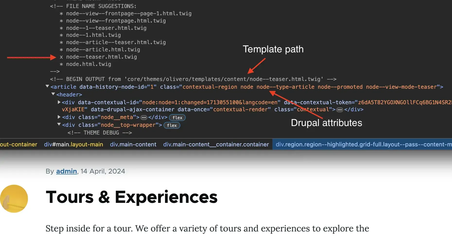
In the example above, we see a list of templates that start with node...*. These are called template suggestions and are the names Drupal is suggesting we can assign our custom templates. The higher the template appears on the list, the more specific it is to the piece of content being rendered. For example, changes made to node.html.twig would affect ALL nodes throughout the site, whereas changes made to node--1--teaser.html.twig will only affect the first node created on the site but only when it's viewed in teaser view mode.
Notice I marked the template name Drupal is using to render the Article node. We know this is the template because it has an X before the template name.
In addition, I also marked the template path. As you can see the current template is located in core/themes/olivero/templates/content/node--teaser.html.twig.
And finally, I marked examples of attributes Drupal is injecting in the markup. These attributes may not always be useful but it is a good practice to ensure they are available even when we are writing custom markup for our components.
Create a template suggestion
By looking at the path of the template in the code inspector, we can see that the original template being used is located inside the Olivero core theme. The debugging screenshot above shows a pretty extensive list of templates suggestions, and based on our requirements, copying the file node--teaser.html.twig makes sense since we are going to be working with a node in teaser view mode.
- Copy /core/themes/olivero/templates/content/node--teaser.html.twig into your theme's /storybook/templates/content/. Create the directory if it does not exist.
- Now rename the newly copied template to node--article--teaser.html.twig.
- Clear Drupal's cache since we are introducing a new Twig template.
As you can see, by renaming the template node--article--teaser (one of the names listed as a suggestion), we are indicating that any changes we make to this template will only affect nodes of type Article which are displayed in Teaser view mode. So whenever an Article node is displayed, if it is in teaser view mode, it will use the Card component to render it.
The template has a lot of information that may or may not be needed when integrating it with Storybook. If you recall, the Card component we built was made up of three parts: an image, a title, and teaser text. Each of those are Drupal fields and these are the only fields we care about when integrating. Whenever when I copy a template from Drupal core or a module into my theme, I like to keep the comments on the template untouched. This is helpful in case I need to reference any variables or elements of the template.
The actual integration ...Finally
- Delete everything from the newly copied template except the comments and the classes array variable
- At the bottom of what is left in the template add the following code snippet:
{% set render_content = content|render %}

{% set article_title = {
    'level': 2,
    'modifier': 'card__title',
    'text': label,
    'url': url,
  }
%}

{% include '@molecules/card/card.twig' with {
  'attributes': attributes.addClass(classes),
  'image': content.field_image,
  'title': article_title,
  'teaser': content.body,
} only %}- We set a variable with
content|renderas its value. The only purpose for this variable is to make Drupal aware of the entire content array for caching purposes. More info here. - Next, we setup a variable called article_title which we structured the same way as data inside card.yml. Having similar data structures between Drupal and our components provides many advantages during the integration process.
- Notice how for the text and url properties we are using Drupal specific variables (label and url), accordingly. If you look in the comments in node--article--teaser.html.twig you will see these two variables.
- We are using a Twig include statement with the @molecules namespace to nest the Card component into the node template. The same way we nested the Title component into the Card.
- We mapped Drupal's attributes into the component's attributes placeholder so Drupal can inject any attributes such as CSS classes, IDs, Data attributes, etc. into the component.
- Finally, we mapped the image, title and teaser fields from Drupal to the component's equivalent fields.
- Save the changes to the template and clear Drupal's cache.
Enable the Storybook theme
Before we forget, let's enable the Storybook theme an also make it your default theme, otherwise all the work we are doing will not be visible since we are currently using Olivero as the default theme. Clear caches after this is done.
Previewing the Article node as a Card
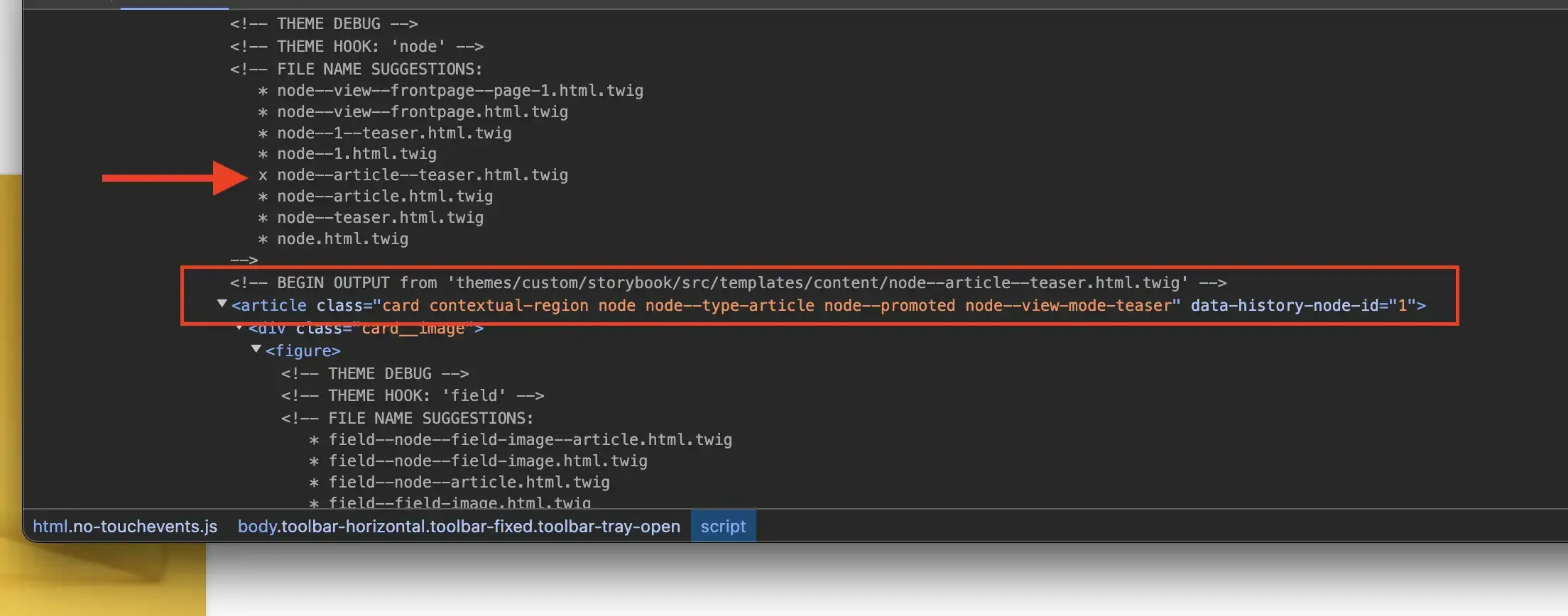
Integration is done and we switched our default theme to Storybook. After clearing caches if you reload the homepage you should be able to see the Article node you wrote but this time displayed as a card. See below:
- If you right-click on the article and select Inspect, you will notice the following:
- Drupal is now using node--article--teaser.html.twig. This is the template we created.
- The template path is now themes/custom/storybook/src/templates/content/.
- You will also notice that the article is using the custom markup we wrote for the Card component which is more semantic, accessible, but in addition to this, the
<article>tag is also inheriting several other attributes that were provided by Drupal through its Attributes variable. See below:
If your card's image size or aspect ratio does not look as the one in Storybook, this is probably due to the image style being used in the Article Teaser view mode. You can address this by:
- Going to the Manage display tab of the Article's Teaser view mode (
/admin/structure/types/manage/article/display/teaser). - Changing the image style for the Image field for one that may work better for your image.
- Preview the article again on the homepage to see if this looks better.
Download the code
For a full copy of the codebase which includes the work in this and the previous post, clone or download the repo and switch to the card branch. The main branch only includes the previous post code.
In closing
This is only a small example of how to build a simple component in Storybook using Twig and then integrate it with Drupal, so content is rendered in a more semantic and accessible manner. There are many more advantages of implementing a system like this. I hope this was helpful and see the potential of a component-driven environment using Storybook. Thanks for visiting.


I welcome your feedback about this post.